Project name
Bankier
Pro-bono local community project - local primary school
The brief
Our local primary school and nursery wanted an update to their school badge logo mark, which had become outdated and challenging to use across various platforms, from signage to documentation. The original mark no longer reflected the school’s welcoming community spirit and was difficult to apply in modern contexts, particularly when scaled down or used digitally. However, the school emphasised that they didn’t want to stray too far from their current identity, as it was already recognised and supported by the local community. The challenge was to refresh the logo while retaining its familiarity and connection to the school’s values.
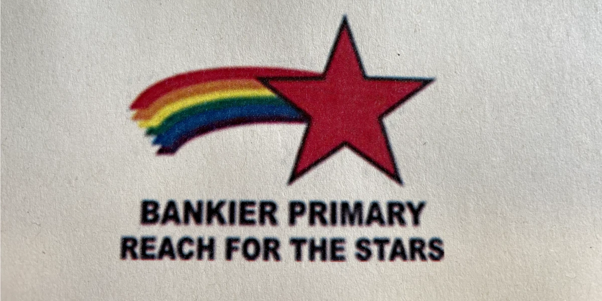
Original logo


The solution
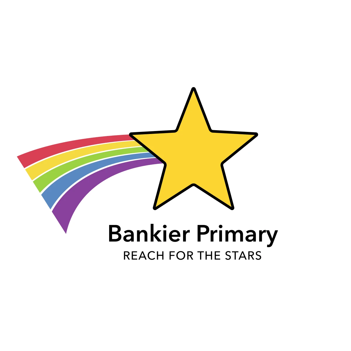
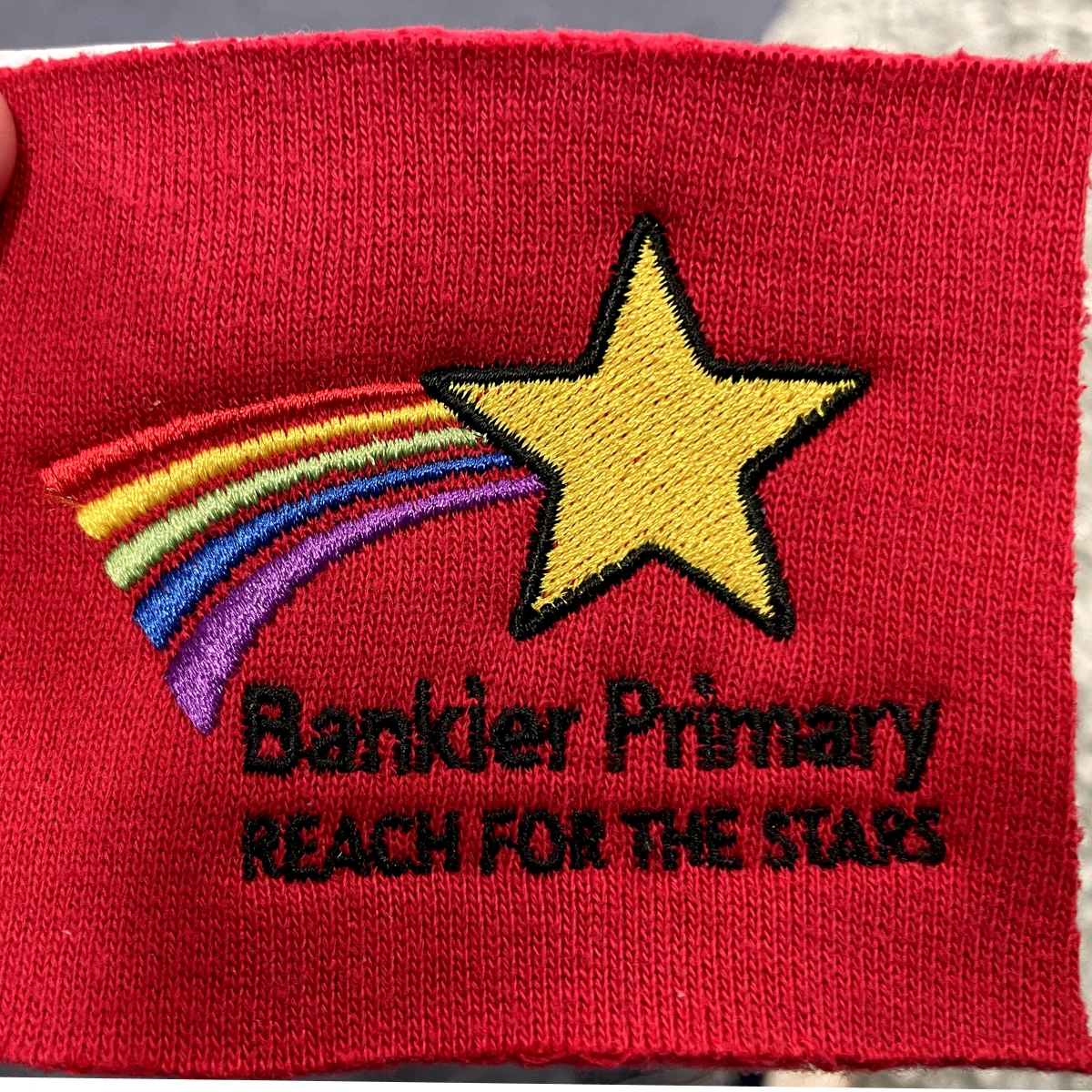
Our approach was to retain the essence of the original mark but refine and simplify it for a more modern and versatile application. One of the first major changes we made was moving away from the red star, which they they wanted changed for obvious reasons. Additionally, the school’s uniforms are red, causing the badge to blend in rather than stand out. We aimed to make the badge more visible and distinctive, so students could wear it with pride.
To create a friendlier and more approachable look, we softened the corners of the star. This subtle adjustment made the logo feel less rigid and more welcoming, in line with the nurturing environment the school wanted to project. By keeping the star but modernising its form, we were able to maintain a connection to the original mark, preserving its familiarity for the community.
The rainbow, another key element of the logo, was simplified. The original rainbow featured a wide range of colours that, while vibrant, made the mark feel overly complex and difficult to reproduce accurately across different media. We streamlined the rainbow down to five core colours, making it more cohesive and easier to apply across various formats, from digital platforms to physical signage. The simplified colour palette also gave the logo a cleaner, more polished look and feel.
View all case studies
Get in touch
Let's see if we're a right fit to help you on your business journey.

