Project name
Calderside Academy
The brief
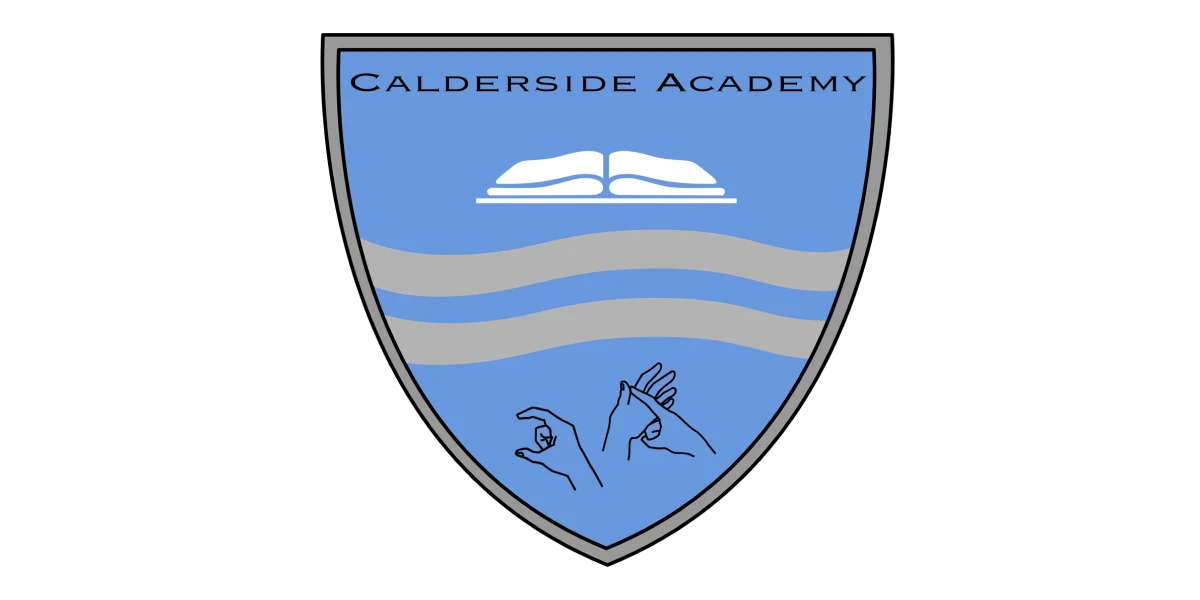
The local school tasked us with simplifying their existing badge, which had become too intricate and difficult to use across multiple platforms and sizes. The badge needed to work well in a variety of formats—from the school website and digital applications to uniforms and large-scale signage—without losing its integrity or recognisability. The goal was to streamline the design while maintaining its connection to the school’s identity and values.
Original logo


The solution
Our aim was to retain the essence of the badge while simplifying it for more practical and versatile use.
We reduced the complexity of the original design focusing on the core shapes and symbols that defined the badge. This allowed us to create a cleaner, more streamlined version that was easy to recognise, even at smaller sizes. By focusing on simplicity, we ensured that the badge would be scalable without losing its impact, whether it was embroidered on a school uniform or displayed prominently on signage.
A critical part of the redesign involved ensuring the badge worked well in both digital and physical formats. We adjusted line weights and proportions to ensure that the badge remained legible on the school’s website and digital platforms, where it would often be viewed on screens of various sizes. At the same time, we made sure the badge would still look crisp and clear when printed on fabric for uniforms or displayed on large outdoor signage.
View all case studies
Get in touch
Let's see if we're a right fit to help you on your business journey.
