A finance conference that nobody would call a finance conference
Finance Takes The Piste
Braeface designed the brand strategy, identity, website, merchandise, and post-event whitepapers for finance takes the piste, a five-day thought-leadership retreat in the French Alps. Now in its fourth year.
Skiing, yoga, private chefs, and the future of finance
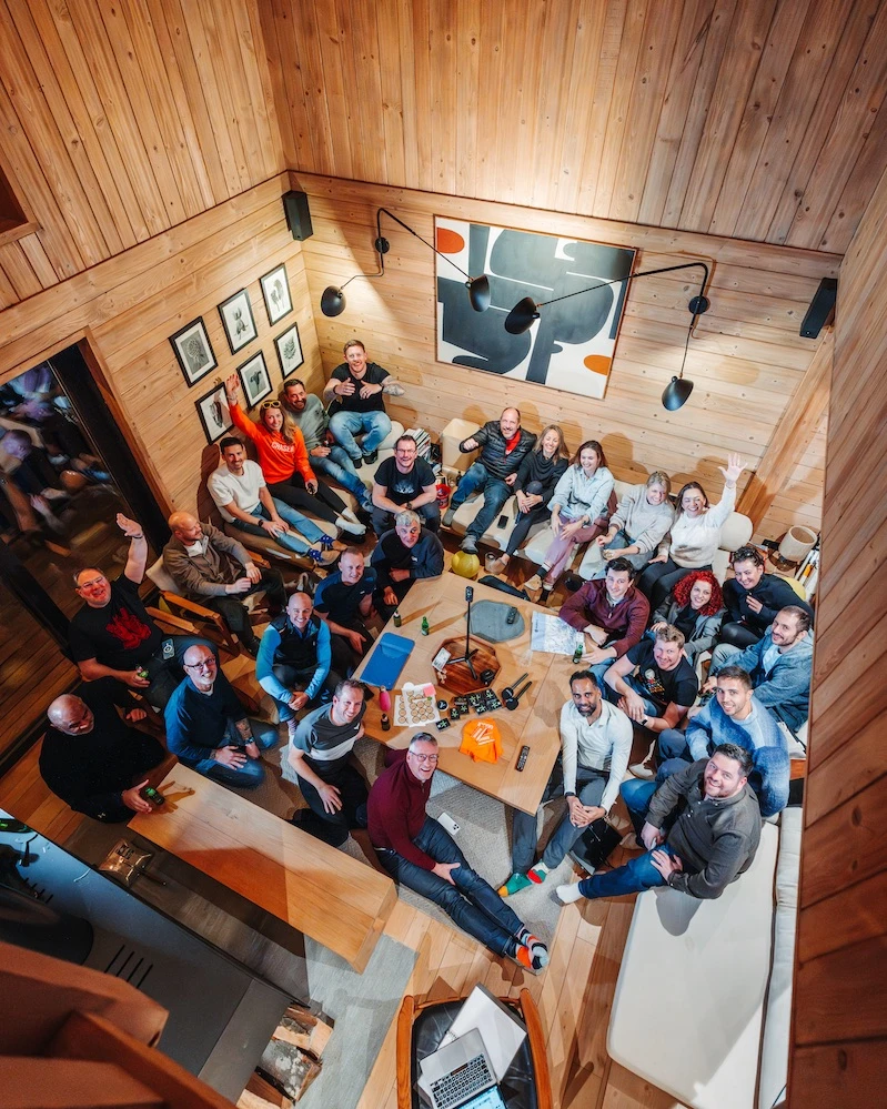
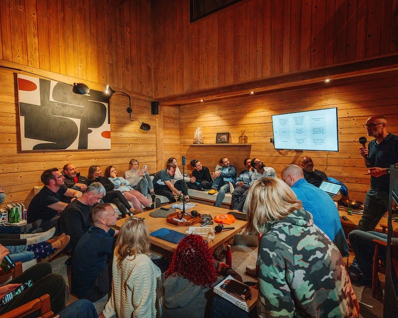
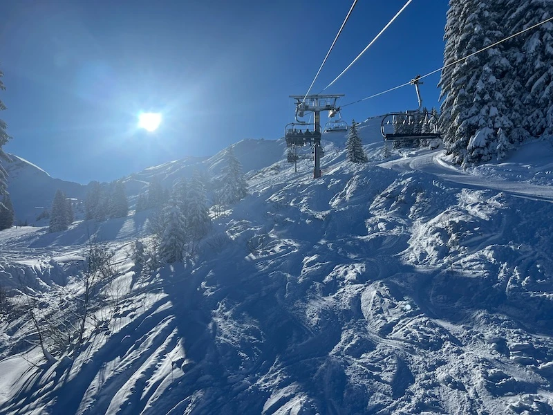
Alastair and Luke had an idea. Bring 20-30 finance leaders together in a ski chalet in the French Alps for five days. Not a conference. Not a corporate away-day with name badges and bad coffee. A retreat.
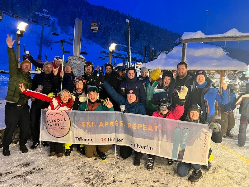
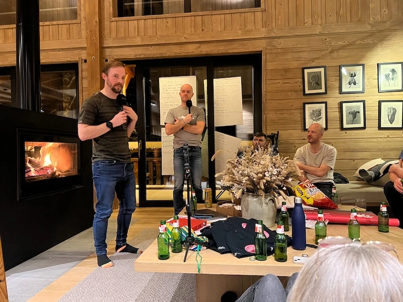
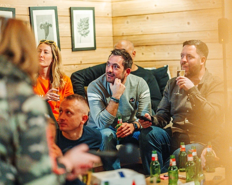
The format was deliberate. Skiing in the morning. Yoga. Private chefs at the chalets. Then breakaway workshops where finance thought-leaders and pioneers could dive deep into the real conversations that don't happen at industry events. The future of finance. The struggles nobody talks about publicly. The ideas that challenge the status quo. All of it discussed openly, collaboratively, in a setting designed to remove the corporate armour.
The attendees weren't clients. They were peers. Some would say competitors. That was the point. flinder takes the piste brought together people who would normally sit on opposite sides of a pitch deck and put them in the same chalet with the same bottle of wine and the same ski pass.
The event needed a brand. And that brand had to do something tricky: feel like a genuine ski culture event (fun, relaxed, irreverent) while carrying enough depth to signal that this was serious thought-leadership. Nobody was going to fly to Morzine for a jolly. They were coming for the conversations. But the brand needed to make those conversations feel like something worth looking forward to, not something worth enduring.
Competitors in the same chalet, with the same bottle of wine, having the conversations that don't happen at industry events.
Credibility and fun. Usually they fight each other.
Most event brands in professional services default to corporate. Clean, safe, forgettable. The kind of branding that says "this is a serious gathering for serious people." It works, technically. But nobody remembers it. Nobody wears the merch. Nobody tells their peers they need to be there next year.
The other extreme is all personality, no substance. A brand that looks like a ski trip and nothing more. That wouldn't attract the calibre of attendee Alastair and Luke were going after. Finance leaders don't fly to the Alps for a holiday with strangers. They come for the intellectual value. The brand needed to promise that without screaming it.
The answer was in the layering. On face value, the brand needed to feel embedded in ski culture. Fun, humoured, approachable. The kind of identity that sits naturally alongside Le Folie Douce and the apres-ski scene. But underneath, the design had to carry depth. The quality of the typography, the considered colour palette, the thoughtfulness of the badge design. Those details are what signal to a senior finance leader that this is worth their time.
The fun gets their attention. The craft earns their respect.
In ski culture, the badge is the identity
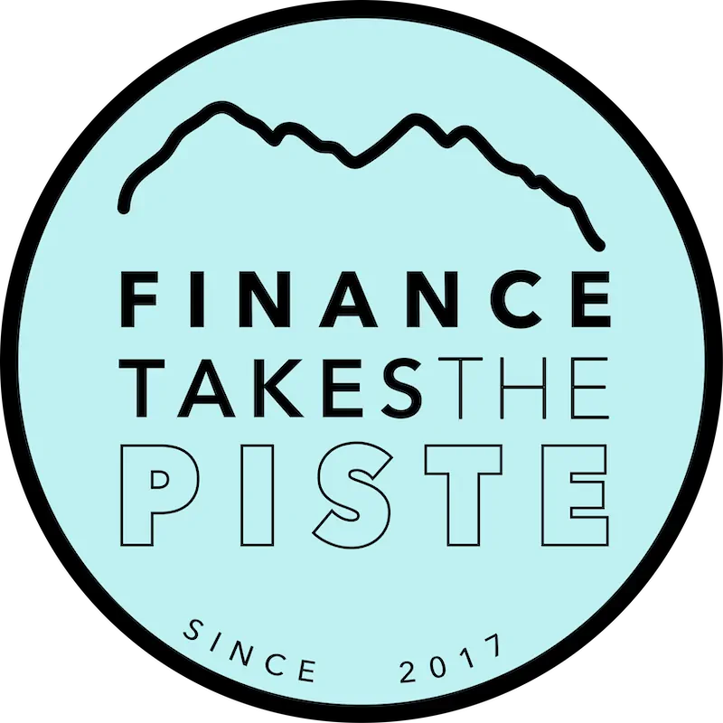
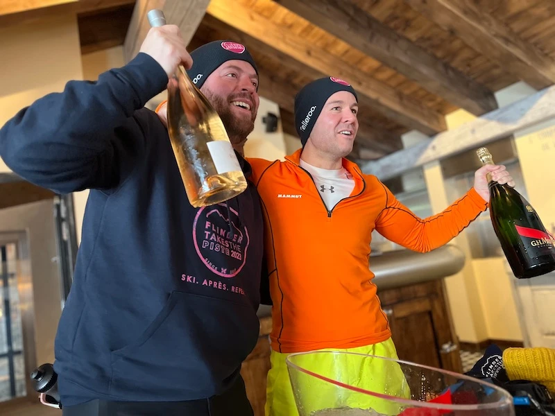
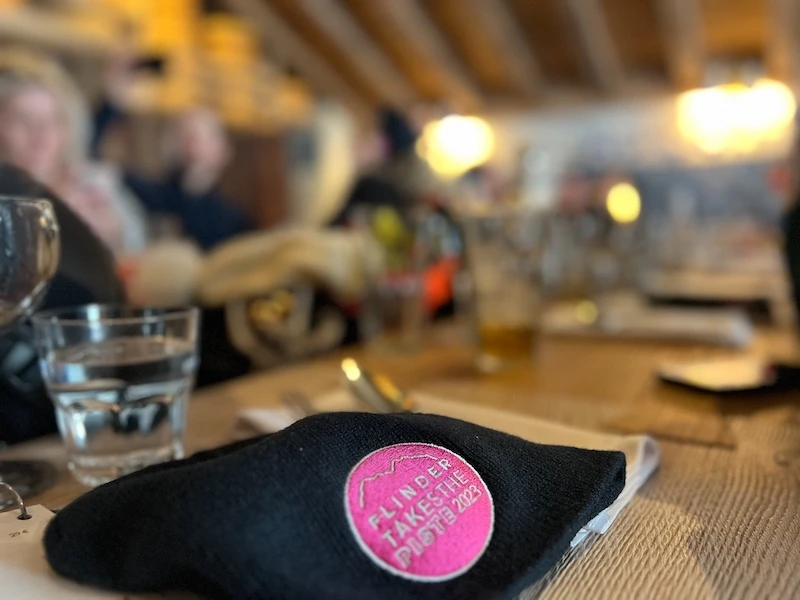
The badge was everything. In ski culture, the badge is the identity. It's on the hat, on the jacket, on the gondola bar. It's what people recognise and what they wear with pride. If the badge didn't work, nothing else mattered.
I drew inspiration from the alpine setting and the ski community in Morzine. The design referenced mountain peaks, ski culture motifs, and the visual language of resort brands. But it wasn't a clip-art mountain on a circle. It was built with the same level of craft I'd bring to any brand identity. Clean lines, considered proportions, and a personality that matched the founders behind it. Alastair and Luke are not corporate people. They're sharp, funny, and slightly irreverent. The badge needed to feel like them.
The colour palette tied subtly back to flinder (this was still a flinder sub-brand at that point) but used softer, more alpine tones. Pastels that reflected the mountain environment without losing the energy of the event.
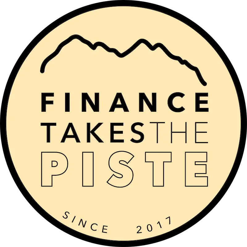
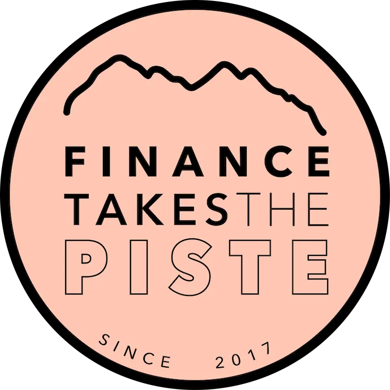
And here's the detail that keeps the brand fresh: each year, I rotate the badge through a pre-set colour system. Year one gets one palette. Year two gets another. Same badge, different colour. It gives each edition its own visual identity (perfect for merch, signage, and social content) while keeping the overall brand consistent.
Four years in, attendees can tell which year's hat someone is wearing from across the slope.
In ski culture, the badge is the identity
The badge was everything. In ski culture, the badge is the identity. It's on the hat, on the jacket, on the gondola bar. It's what people recognise and what they wear with pride. If the badge didn't work, nothing else mattered.
I drew inspiration from the alpine setting and the ski community in Morzine. The design referenced mountain peaks, ski culture motifs, and the visual language of resort brands. But it wasn't a clip-art mountain on a circle. It was built with the same level of craft I'd bring to any brand identity. Clean lines, considered proportions, and a personality that matched the founders behind it. Alastair and Luke are not corporate people. They're sharp, funny, and slightly irreverent. The badge needed to feel like them.
The identity extended across everything: event signage, social media graphics, the website, and all the merchandise. Woolly hats. Sunglasses. The kind of stuff people actually keep and use, not the branded tat that goes in a drawer.
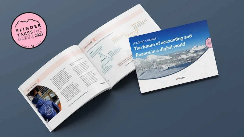
I also designed whitepapers after each event, bringing together the findings from the workshops, breakout sessions, and talks. These extended the brand beyond the five days in the Alps and gave the event year-round visibility as a thought-leadership platform.
From the box to the wash label
The packaging took the same approach as everything else. I designed the full unboxing experience, from the box itself through to the swing tags and the wash labels inside the shirts. Every touchpoint was held to the same standard.
That might sound like overkill for a startup. But in luxury, the details are the product. A customer notices when the wash label has the same typographic quality as the website. And they notice when it doesn't.
If people choose to wear your brand when they don't have to, you've got the identity right.
What clients say...
Alastair
CEO, flinder

An invitation, not an application form
The website served two purposes. Before the event: attract the right attendees, explain the format, and make it easy to register. After the event: house the whitepaper content and keep the brand visible year-round.
The design matched the identity. Alpine energy, not corporate rigidity. The site needed to feel like an invitation, not an application form. The kind of page that makes a finance leader think "I need to be there" rather than "I should probably attend."
When a tech founder landed on this site, they should immediately feel like flinder understood their world.
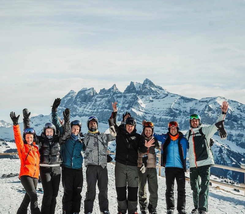
They came. And they came back.
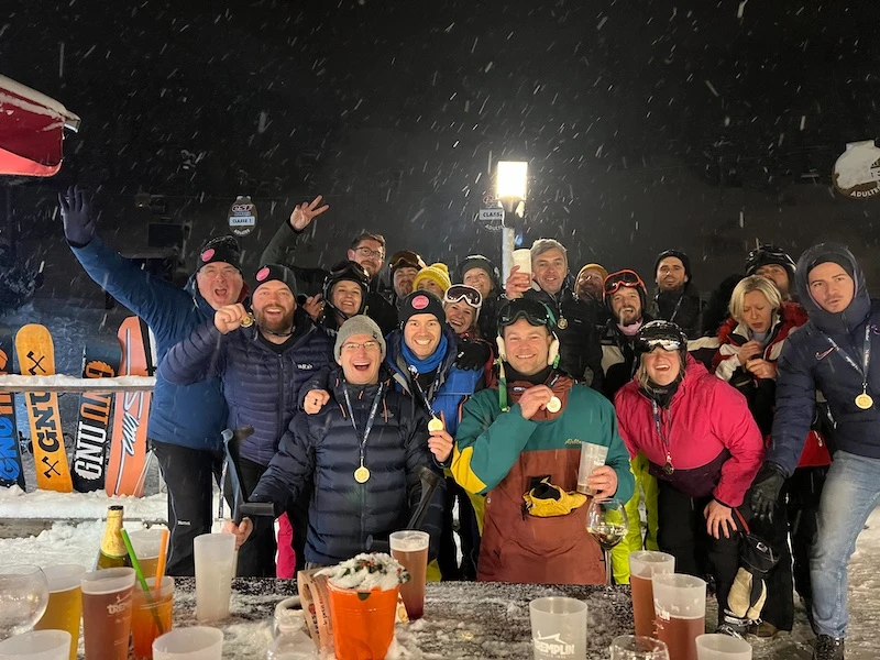
The first year started small. A gathering. An experiment. Would finance leaders actually turn up to a chalet in the Alps and have honest conversations with their competitors?
They did. And they came back.
Four years in, the event has grown in attendees and taken on sponsorships from major accounting and finance technology firms.
The brand played a direct role in that growth. The badge became recognisable. The merch became desirable (people wore the woolly hats while skiing, which is the best kind of marketing you can't buy). The whitepapers gave the event credibility beyond the five days. And the annual colour rotation created a collector's mentality. Year one merch looks different from year four. That's not an accident.
When flinder was acquired in 2025, the event wasn't part of the deal. Alastair and Luke kept it running independently. The only change was the name: from "flinder takes the piste" to "finance takes the piste." The brand barely needed adjusting because it had always stood as its own identity. The logo, the visual language, the personality. All of it was designed to work independently, and when the time came, it did.

ACCA. Xero. Sponsors don't attach their name to something that doesn't carry weight.
Testimonials
What our awesome past clients think of us.
Luke
COO, flinder
Most sub-brands die when the parent gets acquired. This one didn't.
flinder takes the piste started as a sub-brand. A side project within a larger company. It could have died when flinder was acquired. Most sub-brands do.
But the identity was built to stand alone from the start. The visual language was its own. The personality was its own. The connection to flinder was subtle enough that removing it didn't leave a gap. When the name changed to "finance takes the piste," the brand kept going without missing a beat.
Four years. Grown from a small gathering to a sponsored, recognised event. Major finance and tech sponsors on board. Attendees who come back every year wearing last year's hat. A whitepaper series that extends the thought-leadership beyond the slopes.
