Project name
Just Sign
Just Sign is a British Sign Language (BSL) interpreter & communication support provider.
The brief
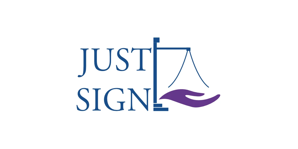
The company was undergoing a significant shift in its focus. Initially centered on serving the justice and court sectors, the business was now transitioning toward the education space. As part of this change in direction, they wanted to move away from the justice scales used in the original logo, which felt too rigid and formal for their new positioning. The goal was to create a brand identity that was warmer, friendlier, and more approachable. Donna, the founder, also wanted to reflect the predominantly female makeup of the team and infuse more of their personality into the brand.
Original logo


The solution
We kicked off the project with a series of brainstorming sessions and concept explorations. During our collaborative discussions, it became clear that while the company wanted a softer and more approachable brand, they also wanted to avoid clichés—particularly imagery like hands, which are often overused in logos for sign language. This insight helped steer the design process toward something more unique and abstract.
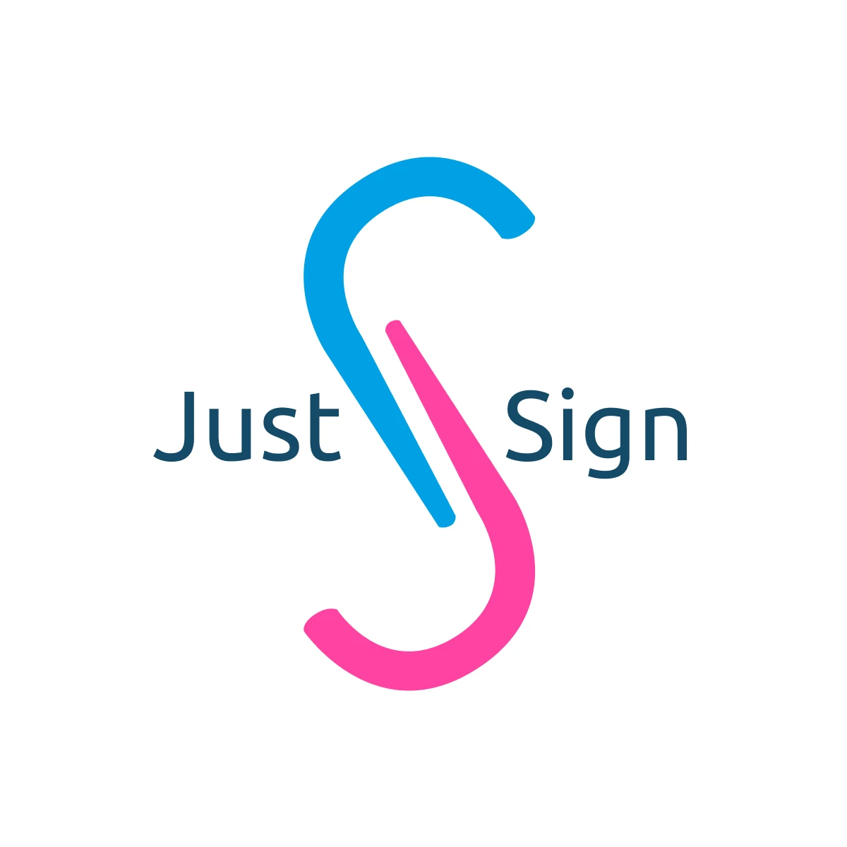
The final logo design merged the "J" from "JUST" and the "S" from "SIGN" into a mark that is subtle yet obvious. Once the concept was agreed many iteration were done to achieve the final look, many before looked like 'clippy', Microsoft paper clip helper.
To reflect the company’s shift toward education and its warmer, more personal tone, we moved away from the darker, more formal colour palette of the previous brand identity. Instead, we introduced a brighter, softer colour scheme that conveys friendliness and approachability, while still feeling professional. The new colours also helped express the brand’s personality—one that’s empathetic, welcoming, and supportive, much like the team itself.
View all case studies
Get in touch
Let's see if we're a right fit to help you on your business journey.


