Project name
Just Sign Ltd
The brief
Donna, the new owner of Just Sign, took over a company that had traditionally operated through word-of-mouth and relied heavily on the reputation of the previous owner in the legal sector. With this transition, Donna wanted to modernise the brand and increase its visibility in the marketplace. The company specialises in providing interpreters, particularly for courts and legal matters, and the goal was to create a brand identity that would reflect its professionalism, relevance in the legal field, and its focus on sign language interpreting.

The solution
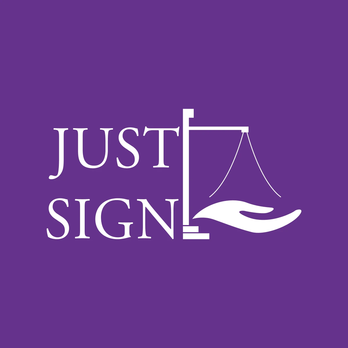
Our approach centered on creating a logo that captured the essence of both the legal services provided by the company and the sign language interpreting focus. The challenge was to design a mark that could embody these two distinct elements—justice and communication—while creating a modern and professional identity that would set the brand apart in the legal interpreting field.
We began by exploring different ways to visually represent the concept of justice. The justice scales, a classic symbol for the legal system, were a natural choice. However, we wanted to integrate them into the design in a way that felt fresh and relevant, rather than relying on a cliché representation. By simplifying the scales into a clean, minimal form, we ensured that the logo would have a contemporary feel while still being immediately recognisable within the legal context.
To represent the interpreting side of the business, we incorporated the image of a hand into the design—a universal symbol for communication and sign language.
The Result
The rebrand successfully elevated Just Sign from a business that relied on word-of-mouth to a company with a modern, professional identity that resonated with its target audience. The new logo, combining the justice scales and a hand, effectively communicated the dual focus on legal and sign language interpreting, setting the brand apart from its competitors.
The clean, simplified design allowed for versatile use across various platforms and media, from business cards to digital signage. The updated website and branding materials helped Donna position Just Sign as a visible, trustworthy, and modern service provider, significantly increasing the company’s presence..
The clean, simplified design allowed for versatile use across various platforms and media, from business cards to digital signage. The updated website and branding materials helped Donna position Just Sign as a visible, trustworthy, and modern service provider, significantly increasing the company’s presence..
View all case studies
Get in touch
Let's see if we're a right fit to help you on your business journey.
