From courtrooms to classrooms
Just Sign Rebrand
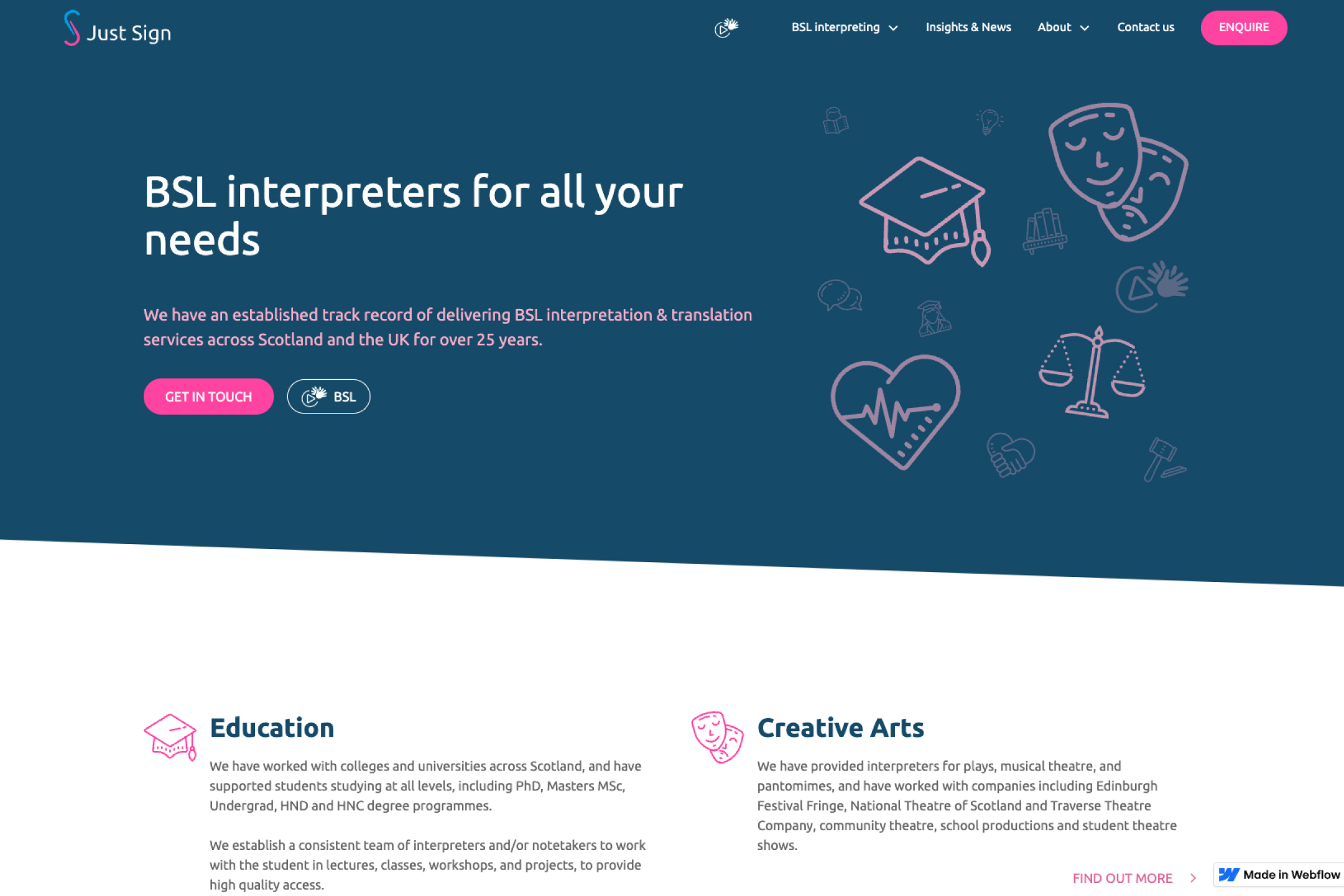
Braeface repositioned Just Sign from the legal sector to education in 2024 through deep brand strategy and a full identity redesign. The new brand replaced corporate purple and justice scales with a warmer, approachable identity for schools and universities.
The brand I built was now working against them
I built the original Just Sign brand in 2016. Purple and blue palette. Corporate tone. A logo with a hand for signing and justice scales for the legal sector. It was designed for courtrooms, police stations, and legal proceedings. And for eight years, it worked.
But the business had shifted. Donna's focus was now education. Schools, colleges, universities. BSL interpreting for students and staff. The legal work hadn't disappeared (Just Sign still has a strong foothold in courts and police that no brand change would affect). But the primary market had changed, and the brand needed to change with it.
Here's the problem. A purple and blue corporate identity with justice scales in the logo doesn't say "we help students learn." It says "we help lawyers communicate." Every visual cue in the 2016 brand was tuned to one market. The colours were serious and corporate. The logo literally depicted the legal system. The overall feel was professional and authoritative.
None of that translates to education. Schools don't want corporate. They want approachable. Universities don't want authoritative. They want collaborative. The brand I'd built eight years earlier was now actively working against the market Donna was trying to reach.
A logo with justice scales doesn't say "we help students learn." The brand was now working against the new market.
Who is Just Sign now?
This was a deep strategy piece. Not a visual refresh. The positioning had to shift fundamentally.
The question wasn't "how do we make the existing brand look more friendly?" It was "who is Just Sign now, and how do they need to show up in a completely different market?"
Education and legal are worlds apart in how they communicate. Legal is formal, structured, hierarchical. Education (particularly primary and secondary) is warm, open, human. The visual language that earns trust in a courtroom actively creates distance in a school.
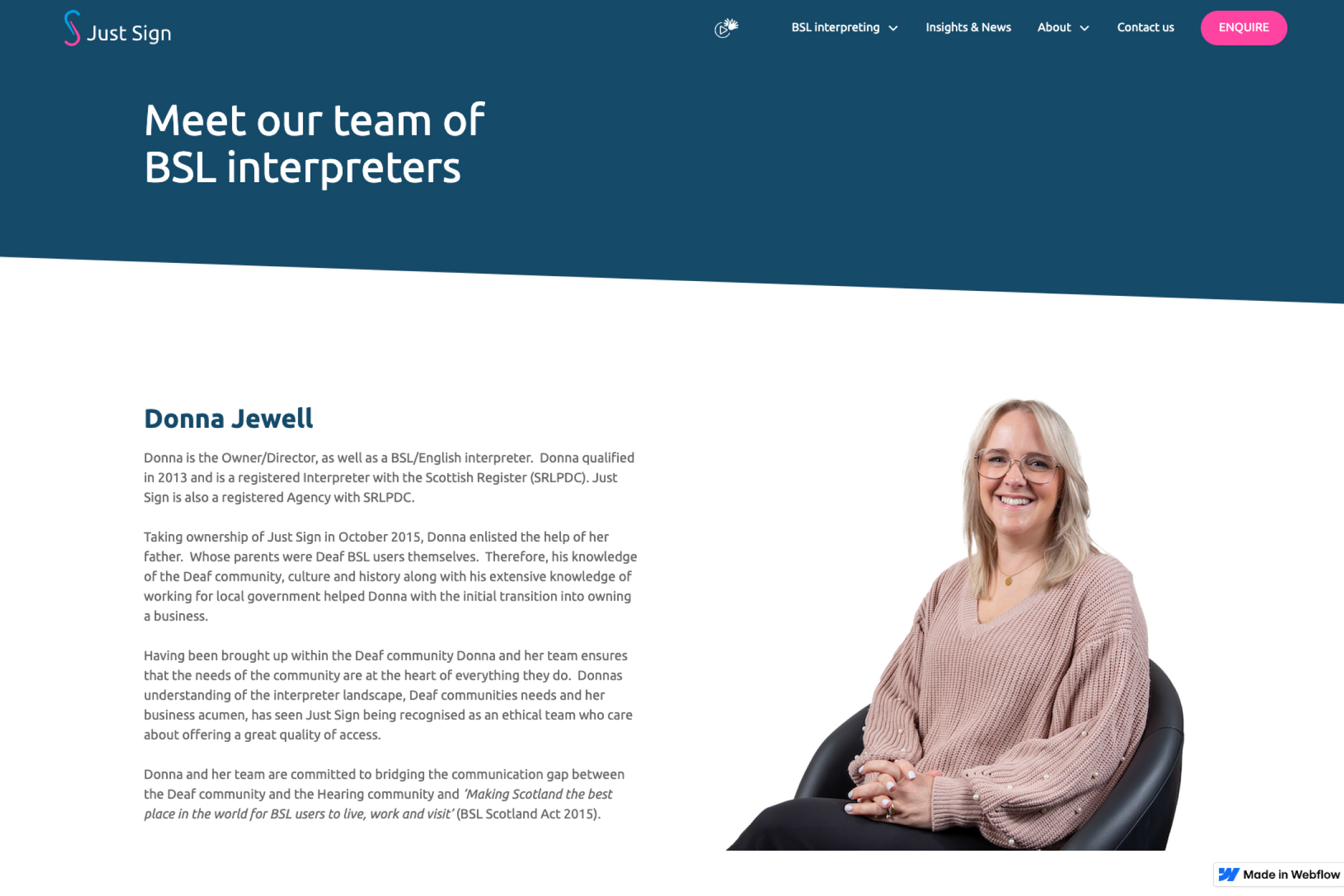
But there was more to it than the market shift. Donna wanted the brand to reflect who Just Sign actually is as a team. The company is predominantly female. The culture is empathetic, supportive, and personable. None of that was coming through in the old brand. The corporate purple and justice scales communicated authority and seriousness, not warmth and personality. Donna wanted the new brand to feel like her team. Not a version of her team dressed in a suit.
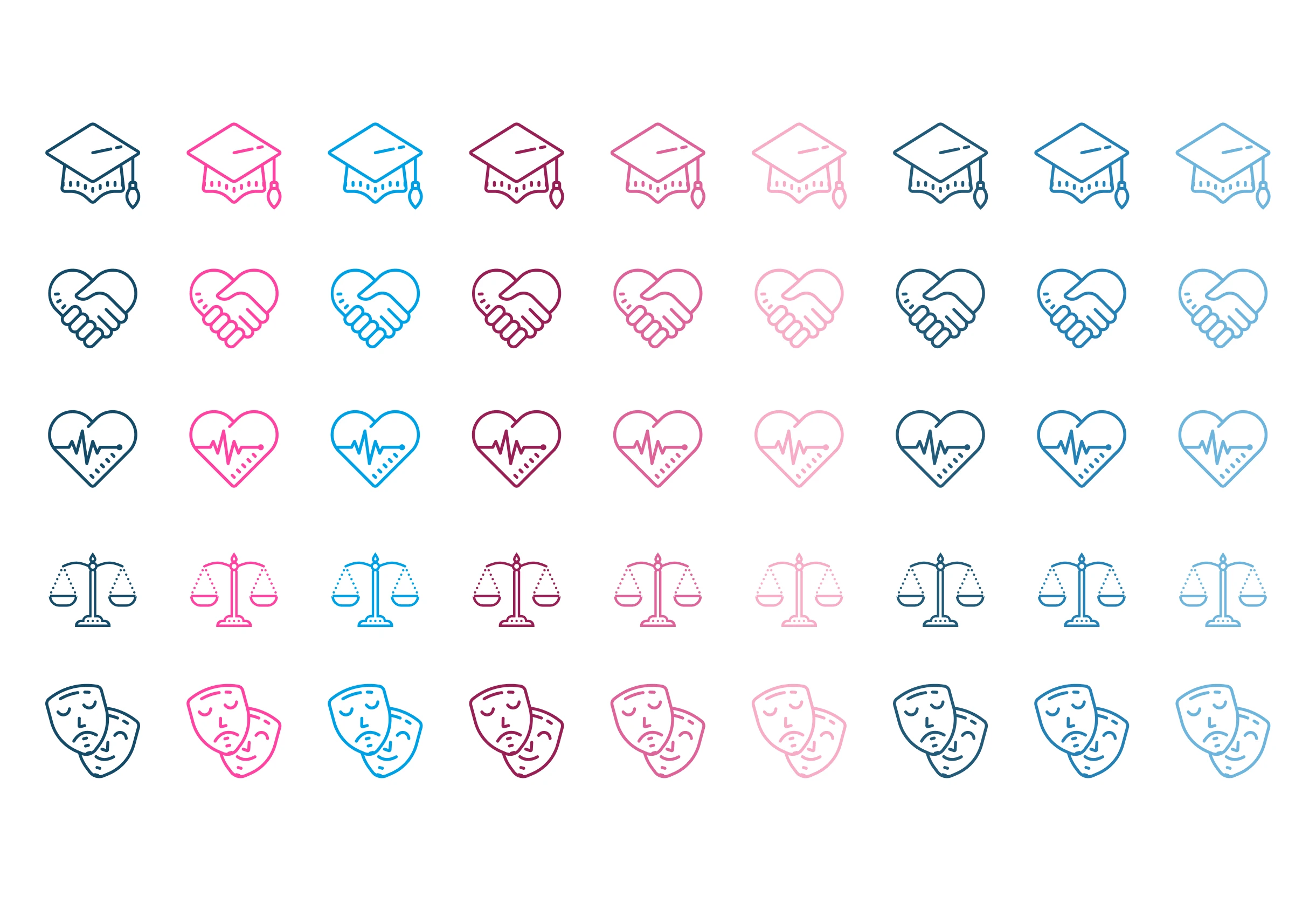
The solution was a mark that merged the "J" from Just and the "S" from Sign into a single, fluid letterform. Subtle but obvious once you see it. The kind of mark that rewards a second look without being cryptic. It took a lot of iterations to get there. Some early versions looked uncomfortably like Clippy (Microsoft's old paperclip helper), which tells you everything about how many wrong turns a good logo goes through before landing on the right one.
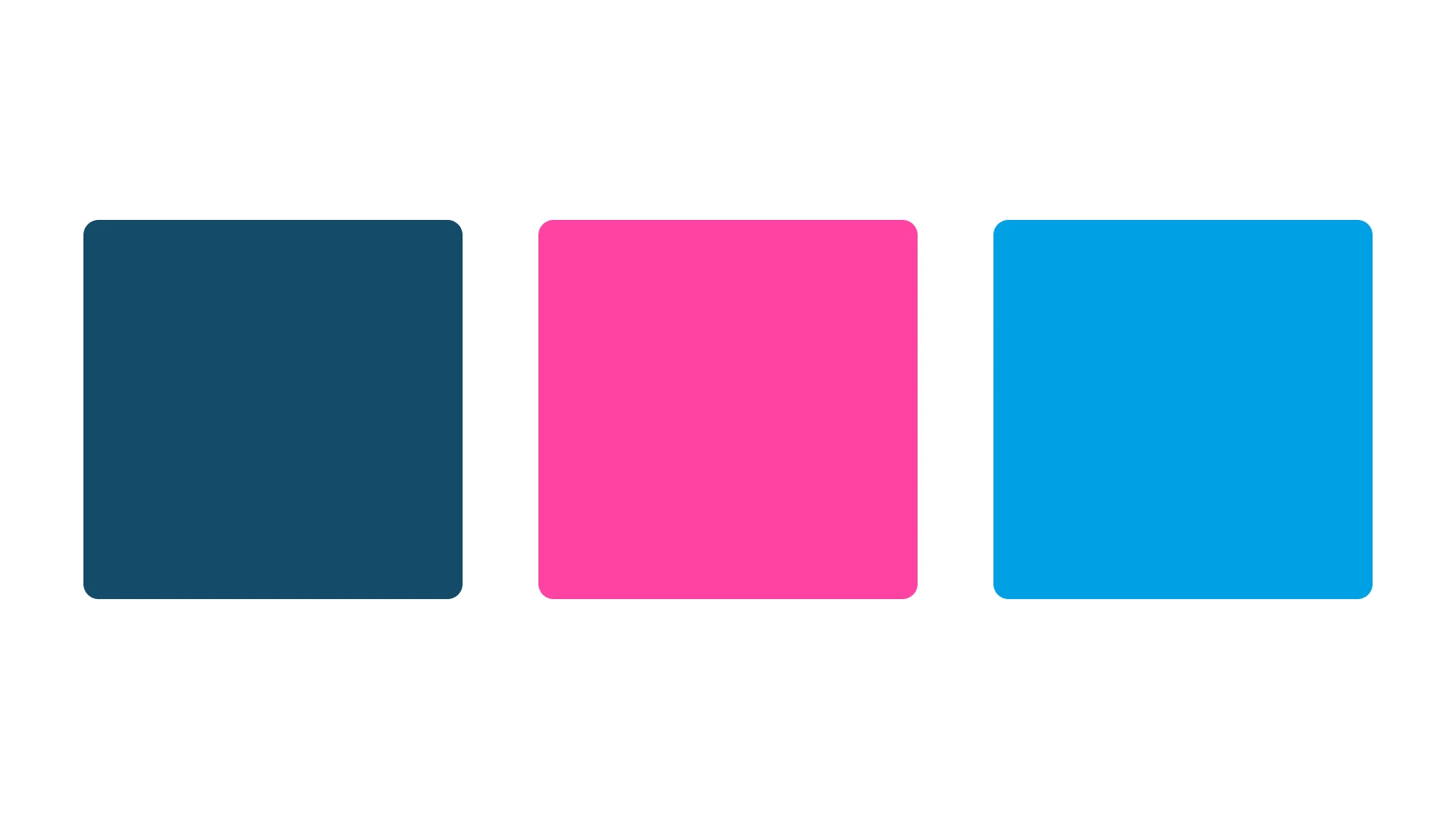
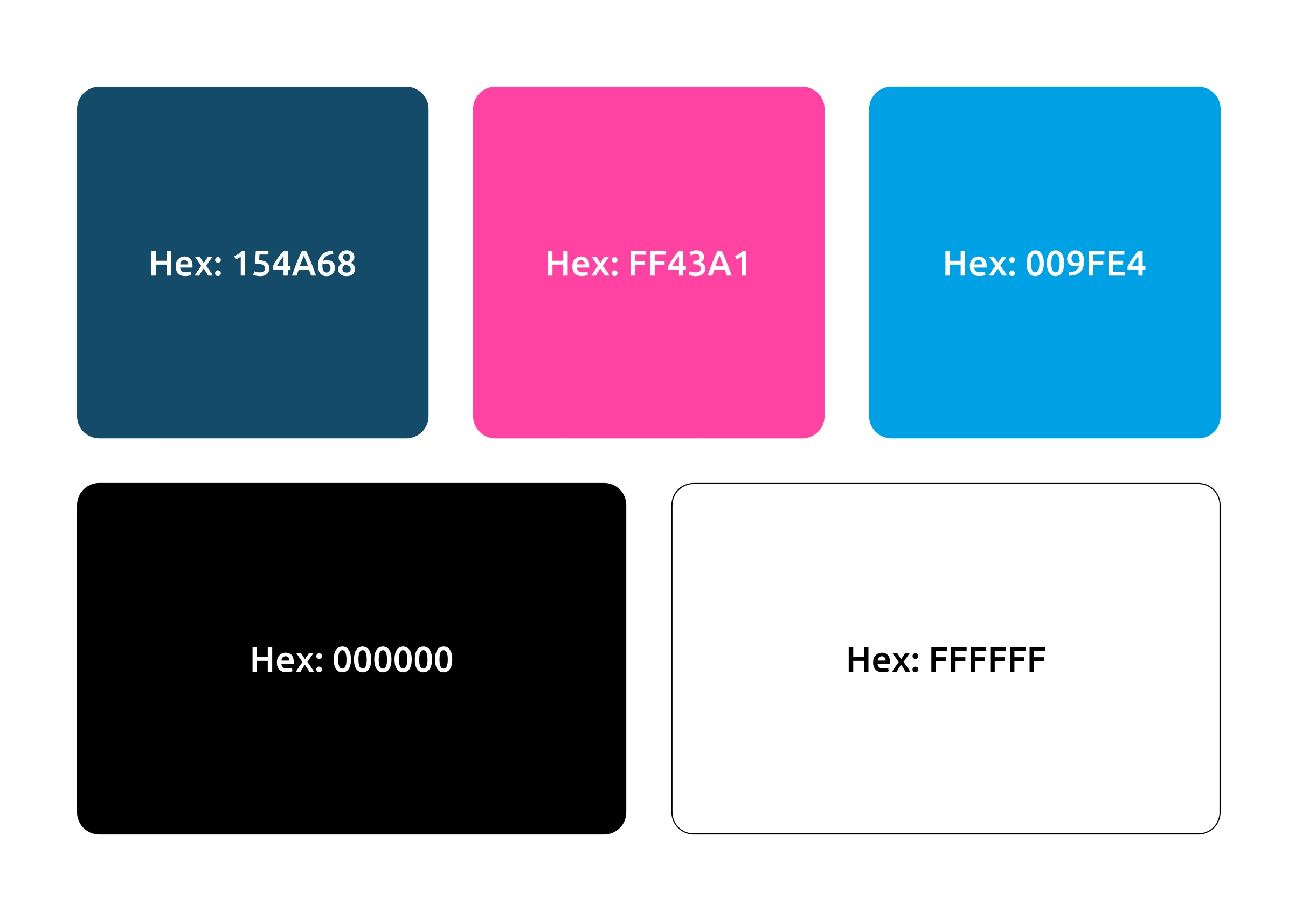
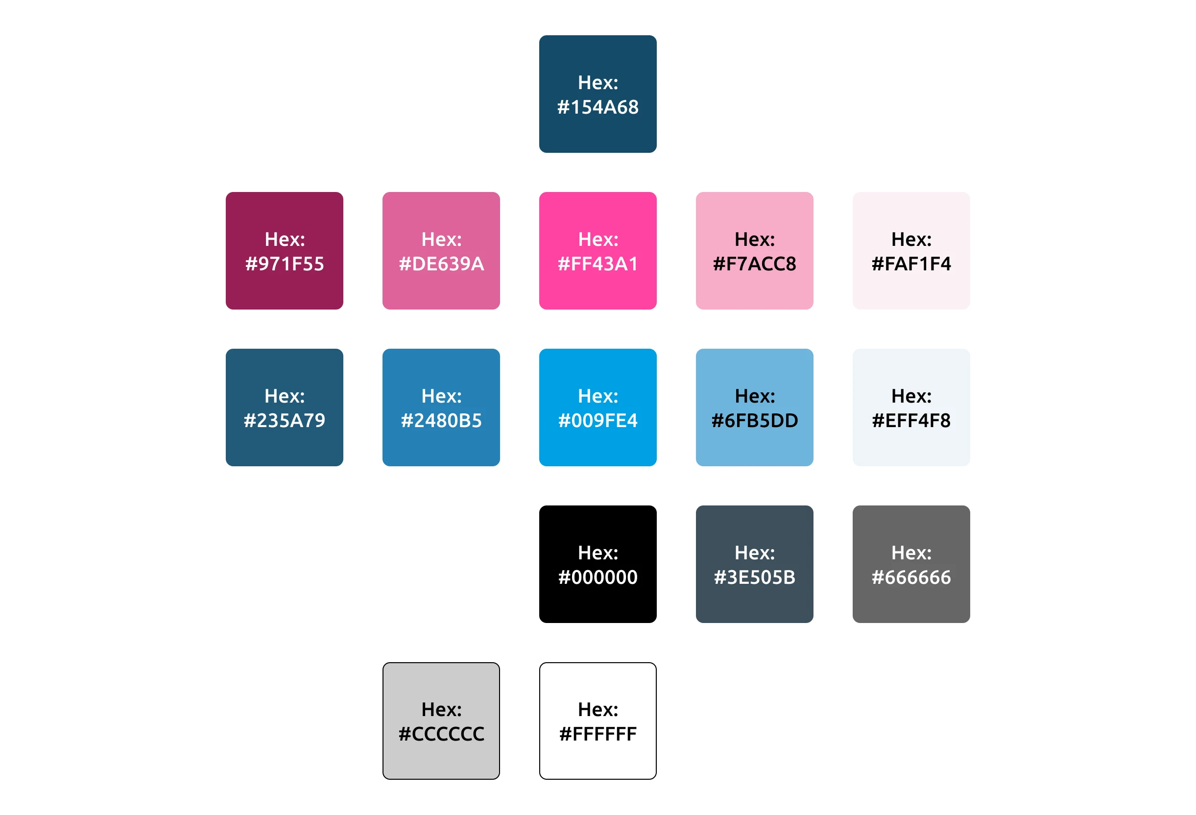
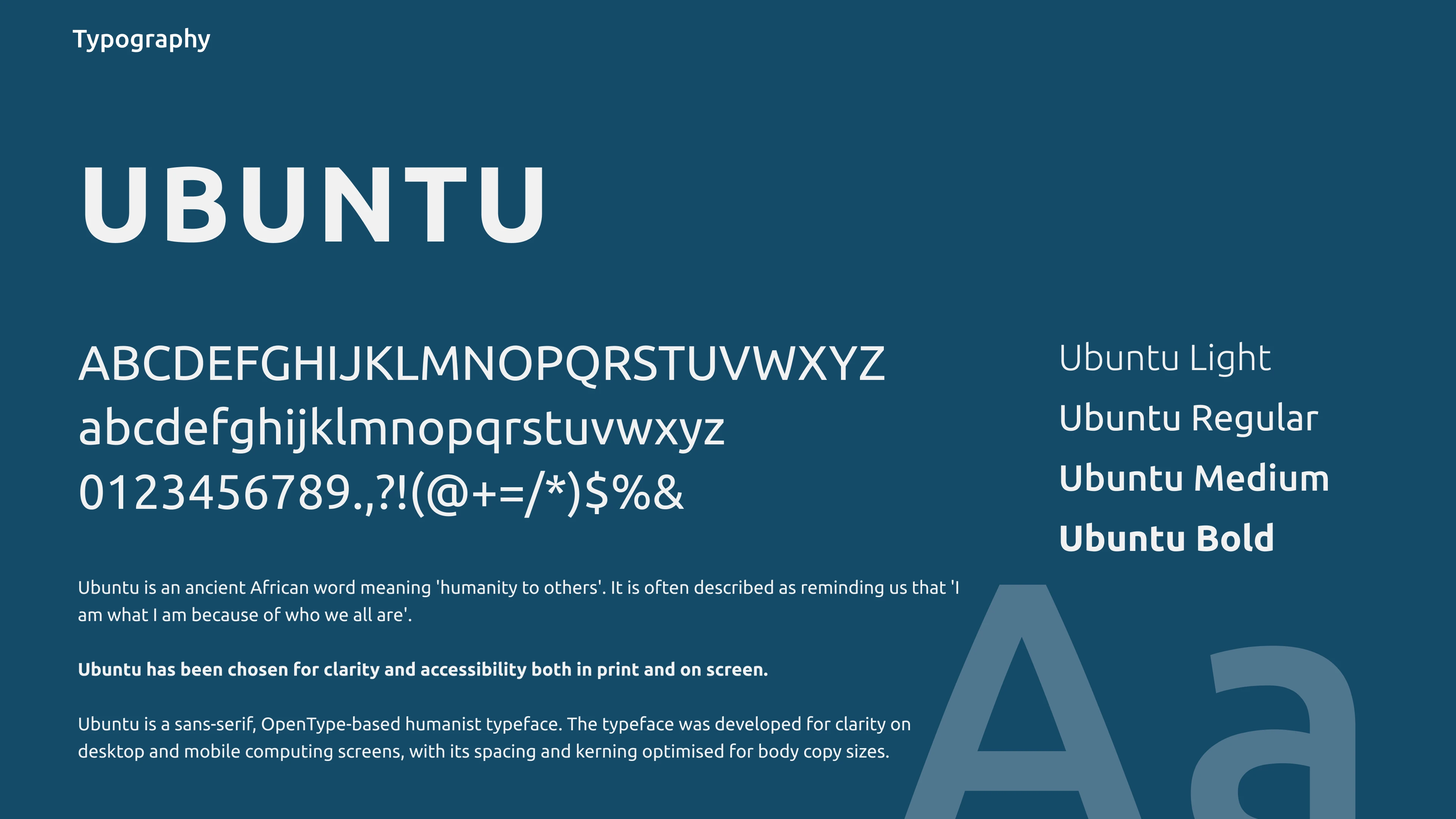
The colour palette shifted completely. Away from corporate purples and blues. Towards something brighter, softer, and warmer. Colours that feel empathetic, welcoming, and supportive. Colours that reflect who Donna's team actually is. A predominantly female team with real personality and warmth. The old brand hid that behind a corporate mask. The new palette lets it come through.
The balance was specific. Go too far towards "friendly" and you look unserious. Stay too corporate and the education market won't connect. The palette lands in a space that's professional enough for a university accessibility officer and approachable enough for a primary school head teacher. That's not a compromise. That's precision.

Every other BSL provider reaches for a hand. I needed to find a different way in.
Warm, approachable, human.
The front door now opens onto education
The rebrand is recent, so the full impact is still unfolding. But the immediate shift is clear.Just Sign now has a brand that speaks to the market they're actively pursuing. When an education decision-maker lands on the website or receives a proposal, the visual identity says "we understand your world." Not "we come from a different one."
That matters more than most people realise. In education, trust and approachability aren't nice-to-haves. They're prerequisites. A brand that feels corporate or legal creates a barrier before a conversation even starts. The new identity removes that barrier.
The legal work continues. The reputation and relationships Donna built in that sector are strong enough that the brand shift doesn't disrupt them. But the front door of the brand now opens onto education. That's where the growth is. That's where the brand is doing its work.
The front door of the brand now opens onto education. That's where the growth is.
A brand isn't permanent
I designed the original Just Sign brand. And eight years later, I redesigned it.
That's an unusual position to be in. Most designers don't get to revisit their own work at a different stage of a business's life. But it taught me something worth sharing.
A brand isn't permanent. It's built for a specific context, a specific market, a specific stage of growth. When any of those things change significantly, the brand needs to change with them. That's not a failure of the original work. The 2016 brand did exactly what it was designed to do. It served Just Sign well for eight years. It helped Donna grow from a solo operation to a company with a team.
But businesses evolve. Markets shift. And a brand that was right for one chapter can hold you back in the next. Recognising when that's happening, and being willing to rebuild rather than patch, is the difference between a brand that keeps working and one that slowly becomes a liability.
