
Doing everything right. Showing none of it.
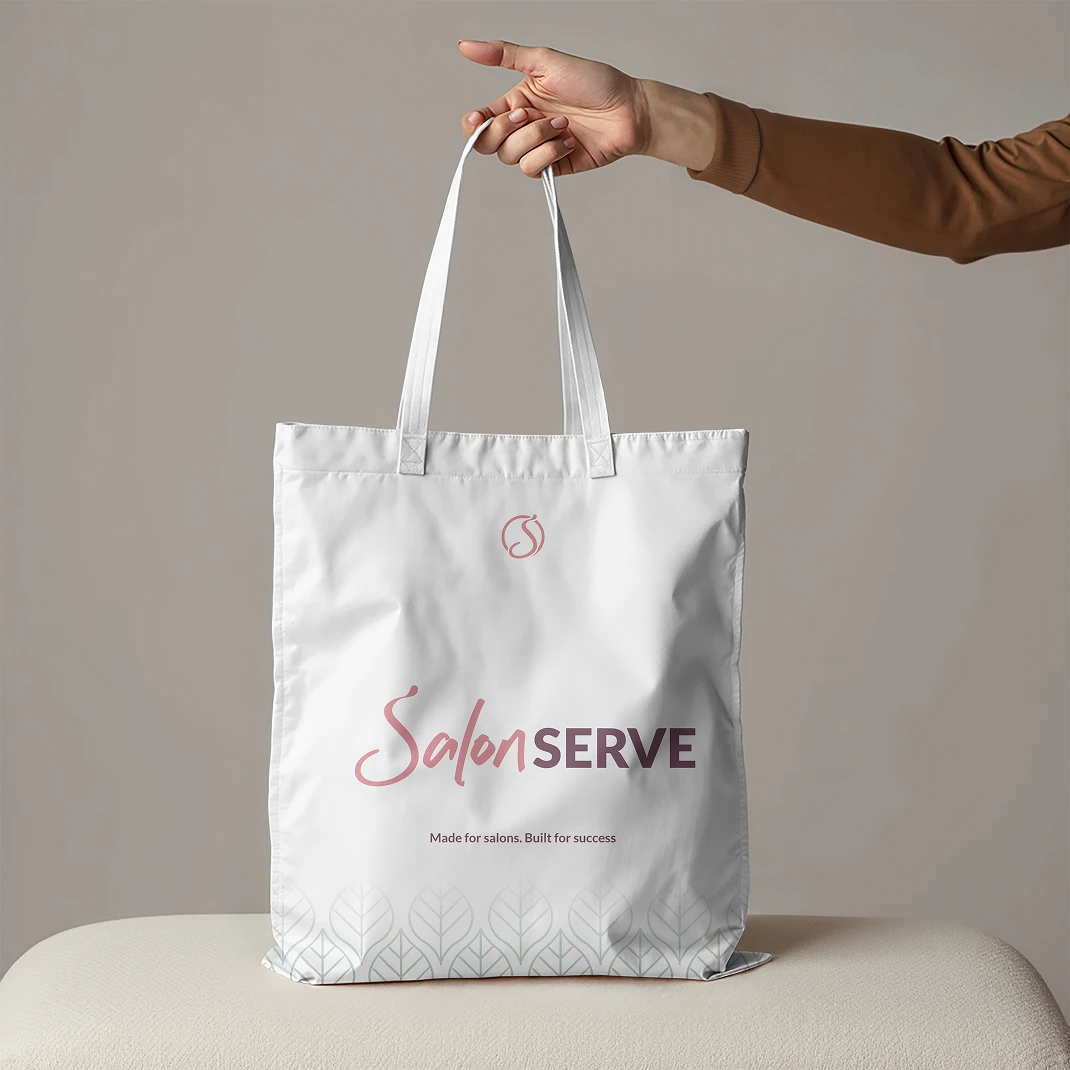
Braeface designed Salon Serve's brand strategy, identity, packaging system, and three sub-brands.
A 30-year beauty wholesaler's brand was realigned to match the quality, trust, and service its customers already knew.
30 years of quality, hidden behind a brand that didn't show it
Salon Serve had been in business for 30 years. Three decades of supplying salon professionals with products, furniture, and equipment. Claire had built something real. A business with genuine loyalty, a reputation for quality, and the kind of warm, honest service that keeps customers coming back year after year.
The problem wasn't the business. The problem was that the brand didn't reflect any of it.
After 30 years, the visual identity was bare. Inconsistent. Incomplete. It had been assembled over time the way most long-running business brands get assembled: a bit here, a tweak there, never quite finishing the job because the business itself was always the priority.
Salon Serve's own-brand products sat on shelves alongside premium brands from established names. And the packaging looked like it belonged to a different tier. Basic. Under-designed. The kind of packaging that makes a salon owner think twice about displaying it alongside their premium stock, even though the product inside was the same quality.
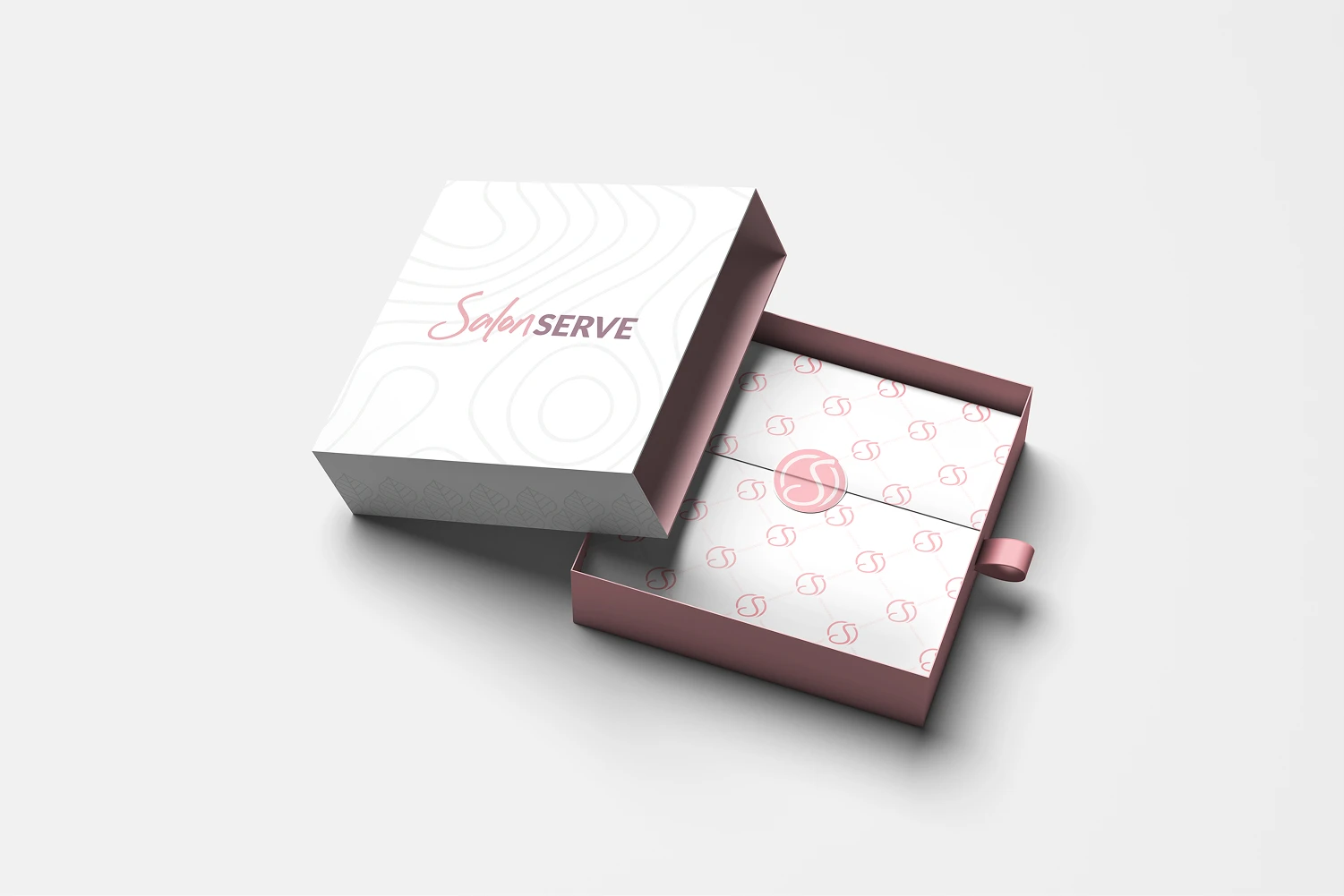
It looked like a budget operation. It wasn't. 30 years of quality, trust, and loyalty, hidden behind a brand that under-represented all of it.
They were doing all the right things. The brand wasn't showing it.
The strategy work on this project was more important than on almost any other I've done. When a business has been running for 30 years, the identity has had decades to drift. Not dramatically. Gradually. A colour choice made in 2005. A font swap in 2012. A product label designed by whoever was available at the time.
The strategy wasn't about inventing something new. It was about helping Claire and her team remember what Salon Serve actually stands for. What makes them different from every other wholesaler. Why their customers stay loyal.
The answer was already there. Quality products. Warm, honest service. Expert support. A carefully curated natural product range that salons genuinely get excited about. Salon Serve was doing all the right things. The brand wasn't showing any of it.
That insight shaped everything that followed. This wasn't a reinvention. It was a realignment. Making what was already true about the business visible in how the brand showed up. Finding their true north after 30 years of gradual drift, and aligning everyone from customer service to warehouse shipping around it.
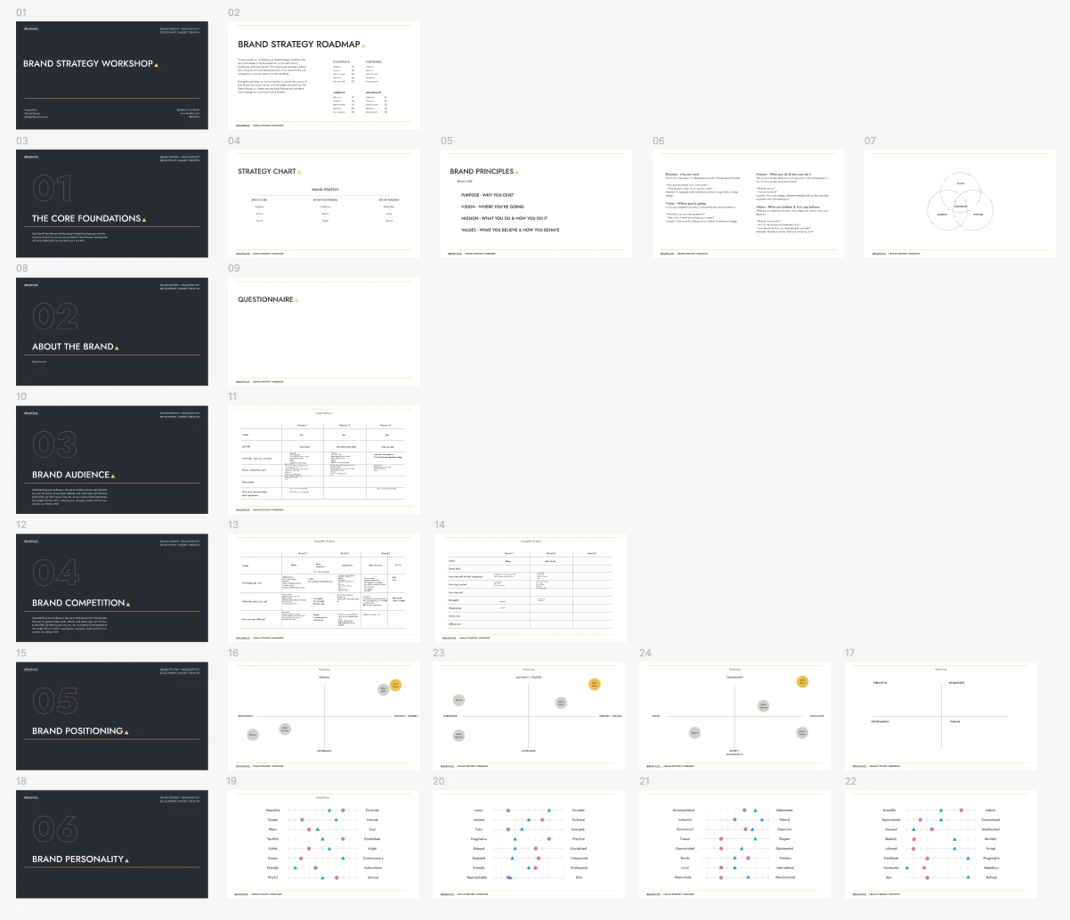
This wasn't a reinvention. It was a realignment. Making what was already true about the business visible.
Evolution, not revolution
This was an evolution, not a revolution. Claire and the team had built something over 30 years. Ripping it all out would have been the wrong call. The existing brand had recognition. It had loyalty. The goal wasn't to make them unrecognisable. It was to make them unmistakable.The old logo had served the business for years, but it had weaknesses. It didn't scale well across sizes. It wasn't a clear enough mark to stand on its own, which weakened the product range because packaging needed the brand to work at much smaller sizes.
Old logo

Old logo

Brand mark

Brand mark inverted

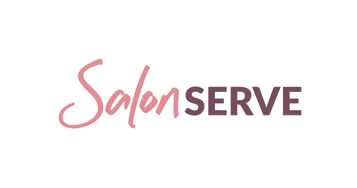
"Salon"
Bespoke custom lettering. Refined, elegant, with a custom S that doubles as a standalone mark for product packaging and smaller applications.
"Serve"
Modified Lato typeface, set in capitals. Grounded, dependable, authoritative. Subtle curves add warmth without losing confidence.
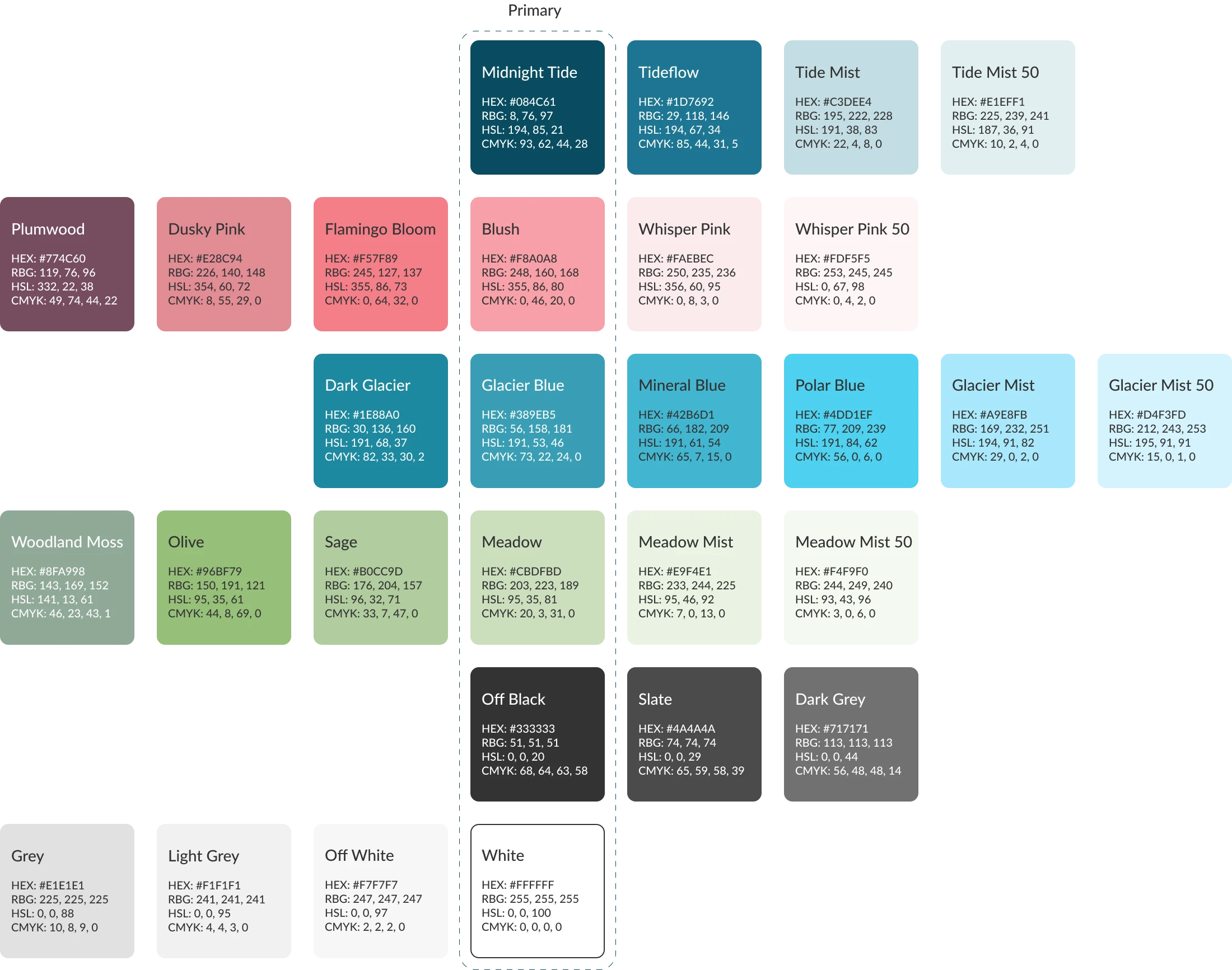
"Original colour"
Kept the main brand colour but repositioned it as an accompanying shade. Maintains recognition for existing customers while allowing the brand to evolve.
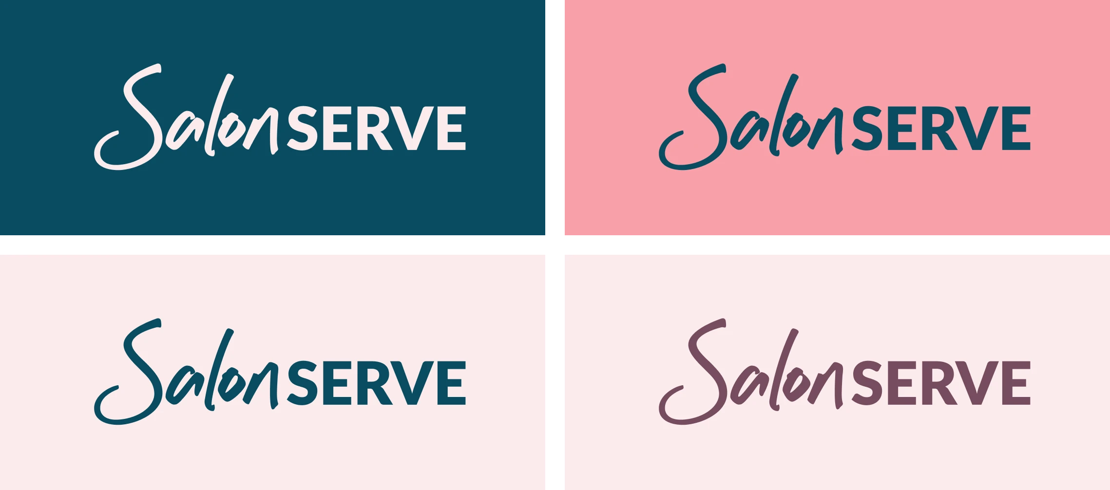
The custom S gives the brand recognition at every scale, from a website header down to a wax strip label.
Nine categories. Four sub-brands. One system.
Salon Serve sells across nine product categories. Each needed to feel on brand while being instantly distinguishable. A salon professional browsing the catalogue should tell at a glance which category they're looking at.

Nail gels

Pedicure products
Waxing line, strips, sticks
Lash products
From under the counter to proudly on the shelf
Salon Serve's own-brand products needed to look like they belonged alongside the premium brands they stock. Not identical. Not imitating. But at the same level of design quality.
I designed the packaging system and created mockups across the product ranges. Stripped out the elements that weren't adding value. Applied the colour system. Unified the labelling conventions. Then handed those designs over as templates for the in-house team to roll out across the full range.
That's the difference between designing a one-off and building a system. A system scales. It gives the team the tools to produce consistent, on-brand packaging themselves, without losing quality.
Before: packaging salon owners hid under the counter. After: packaging they're proud to put on the shelf.
Their developers handled the build. I made sure it felt like Salon Serve.
Claire's development team were working on the backend and UX improvements to the ecommerce system. They were strong on the technical side, but they were backend devs. They needed help translating the new brand into the front-end design.
I worked alongside their team to implement the new identity. The colour system integrated into the product category navigation. I defined the typography, spacing, and layout rules that brought the front end in line with the new brand standards.
From "we like what we have" to "we're in love with it"
Claire's team had been resistant to change at the start. They liked what they had. They didn't see the need for anything different. That's a natural reaction when you've been working with a brand for years.
But when the new brand system came together, the response shifted completely. The marketing team and in-house artwork team were producing cleaner, more readable materials with more confidence. The brand guidelines gave them a framework they didn't have before. Clear rules. Clear constraints. And within those constraints, more creative freedom than they'd ever had.
The rollout started immediately. Facebook. Email campaigns. Spring mailing assets. New product packaging across the ranges. The brand didn't sit in a guidelines document gathering dust. It went to work.
Before
"We like what we have." Resistance to change.
After
"We're in love with it." Energy the team didn't know was missing.
The work most founders put off
Most brand case studies are about businesses that are 2-5 years old. They're in growth mode. They've never invested in brand before. The gap is obvious to everyone.
Salon Serve is different. This is a business that's been running successfully for 30 years. Claire didn't need a brand to survive. The business was already working. Customers were already loyal. The products were already good.
What she needed was a brand that matched the reality. A visual system that showed the quality, the care, the expertise, and the values that her customers already knew. And an identity that could support the next chapter, whether that's growth, succession, or exit.
That's the work most founders put off. They tell themselves the brand is "fine for now." That it'll get done "next quarter." After 30 years, "fine for now" had become "holding us back." Claire recognised that. And in three months, the brand caught up with the business.