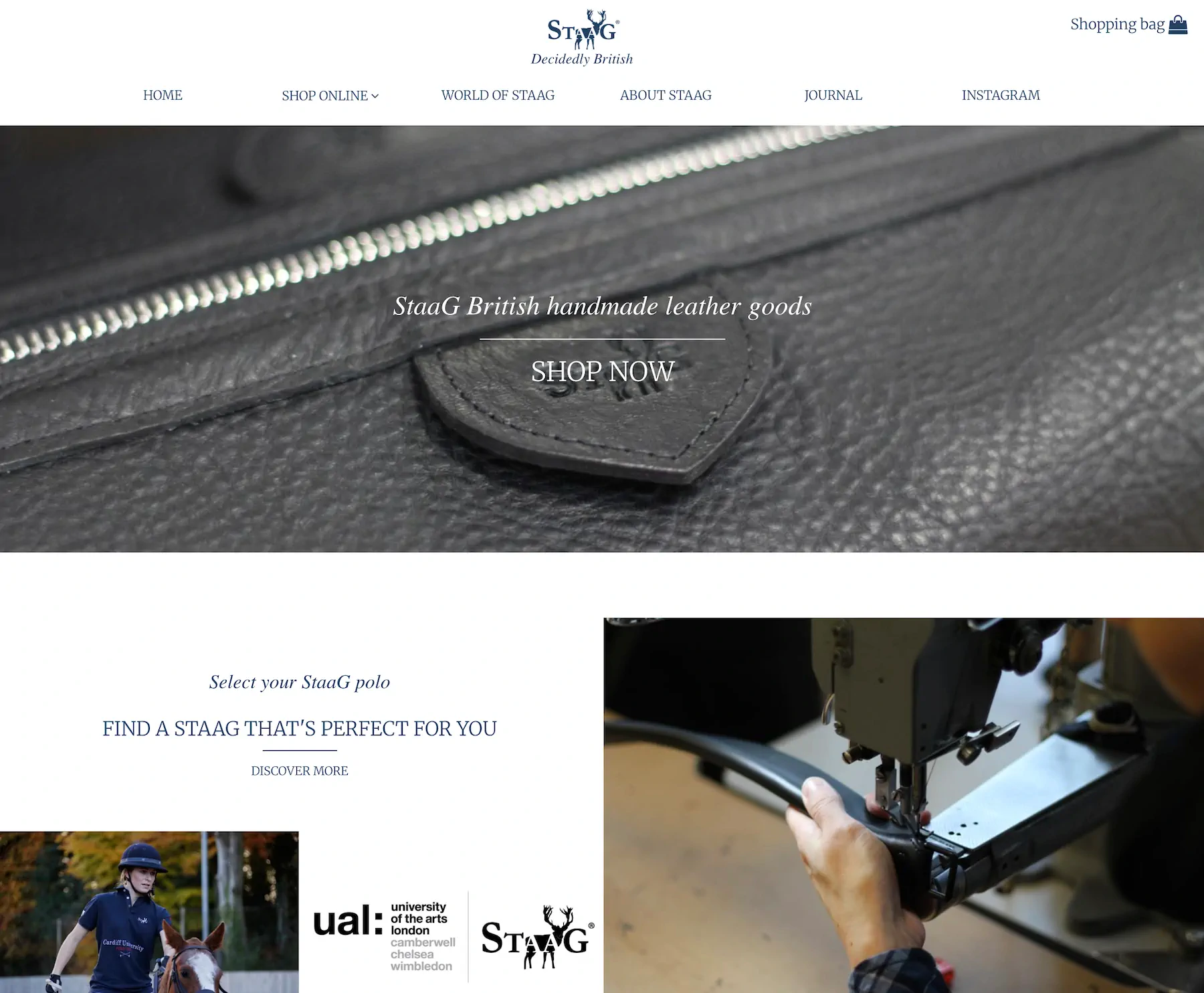
A startup that refused to look like one
StaaG
Braeface built StaaG's brand strategy, identity, packaging, photography direction, and website from scratch in six months. The luxury fashion brand competed with established names from launch and was later sold. The brand became inseparable from the product.
A blank page and a very high bar
StaaG didn't exist yet. There was no old brand to fix, no legacy to work around, no inherited baggage. AJ and his co-founder had a clear vision: build a luxury fashion brand rooted in British sporting heritage, catering to an active lifestyle, that could sit alongside the likes of Ralph Lauren. Not compete on price. Compete on quality, on detail, on presence.
The brand needed to strike a specific balance. Timeless and classic on one hand. Fresh and contemporary on the other. Luxurious but approachable. It had to appeal to customers who appreciate tradition in their activewear but don't want to look like they've raided their grandfather's wardrobe.
That's a different kind of challenge to a rebrand. When you're building from nothing, every single decision defines who you are. There's no existing reputation to lean on. No established customer base giving you the benefit of the doubt. The brand has to do all the heavy lifting from the moment it launches.
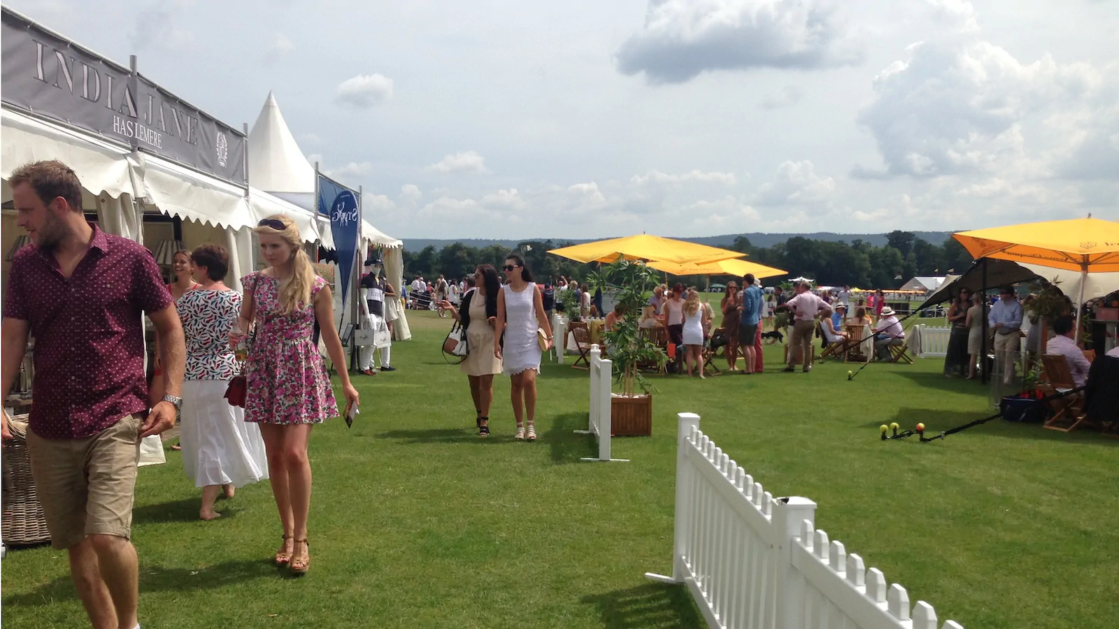
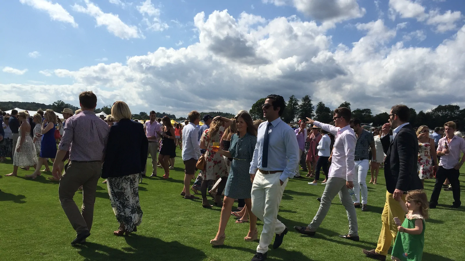
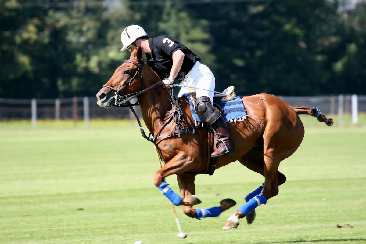
The target market made this even more demanding. StaaG was going after the luxury end. The 20 to 30-somethings who turn up to polo events, drink expensive champagne, and know the difference between a brand that belongs and one that's trying too hard. That audience has a finely tuned radar for anything that feels cheap, forced, or inauthentic. The brand had to be flawless.
The brand had to earn trust before there was any track record to point to.
Building the foundation from nothing
This wasn't a project where strategy uncovered a hidden problem. It was a project where strategy built the foundation for everything that followed.
AJ involved me in every detail from the start. That level of founder involvement made a real difference. We weren't working from a brief that got handed over and left alone. We were building this together, decision by decision, making sure every choice connected back to the positioning: luxury, quality, attention to detail.
The strategic work defined who StaaG was for, how it would show up, and crucially, what it wouldn't do. In luxury, what you leave out matters as much as what you put in. The brand couldn't afford to look like it was trying too hard. It needed the kind of confidence that comes from knowing exactly who you are and who you're talking to.
What I remember most about this project is how early-stage it was. It was scrappy in the best sense. But the strategic foundation meant the output never looked scrappy. It looked like a brand that had been around for years.
In luxury, what you leave out matters as much as what you put in.
The stag, the initials, and a balance most brands get wrong
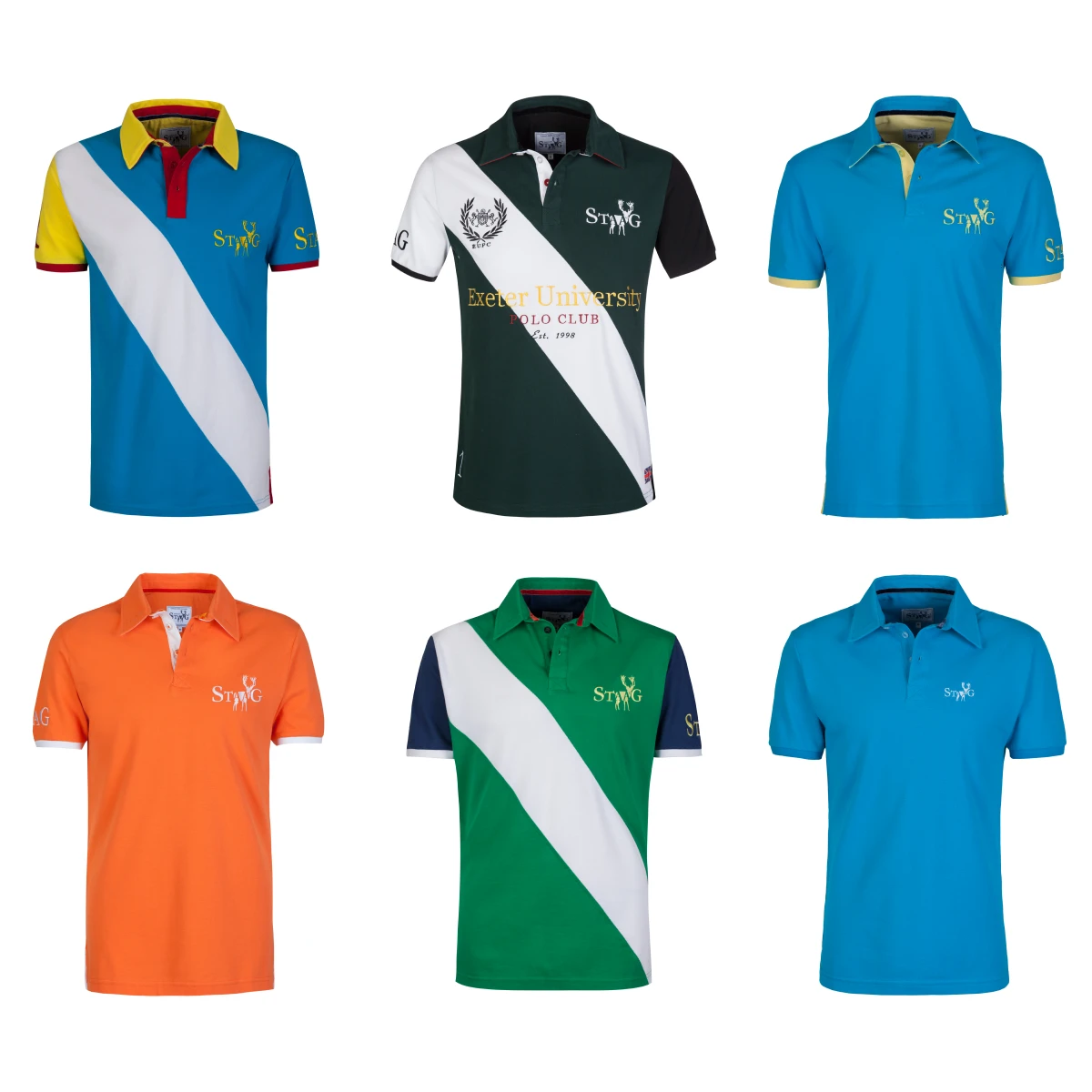
The brief demanded a balance that most startup brands get wrong: tradition and modernity in the same mark. StaaG needed to feel rooted in British sporting heritage (the polo world, the countryside, the culture of it) while also looking clean, contemporary, and forward-thinking. Lean too far into heritage and you end up looking like a crest on a blazer. Lean too far into modern and you lose the authenticity that luxury customers can smell a mile off.
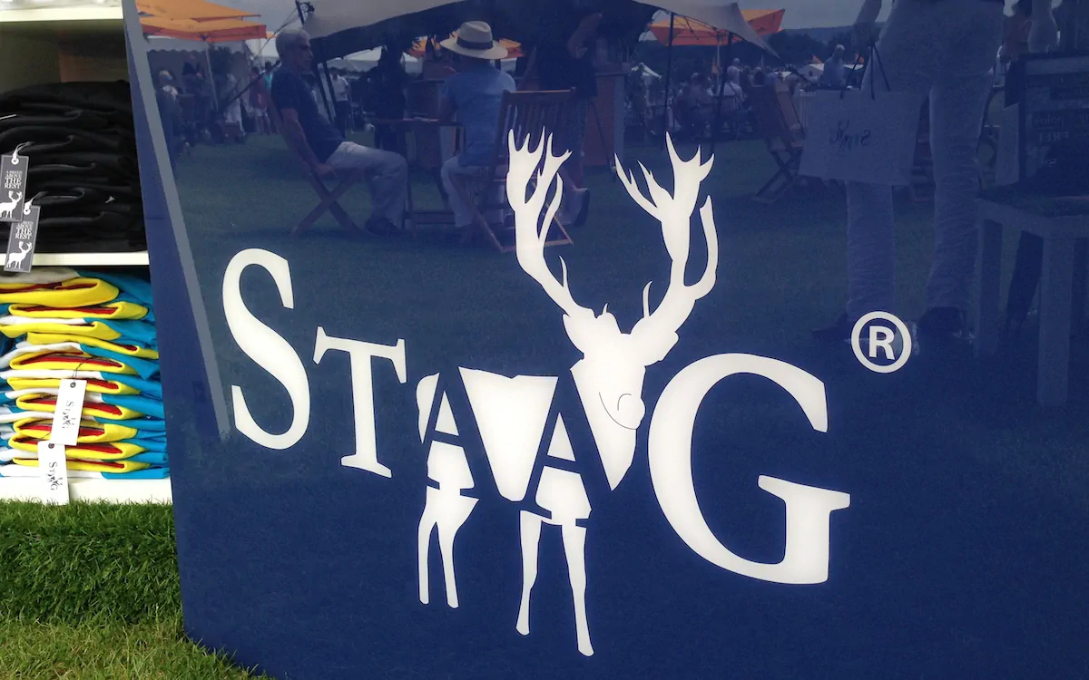
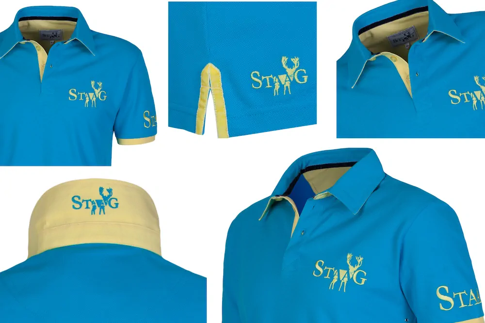
The stag became the answer. It has a natural connection to strength, nature, and British tradition. But the real creative decision was embedding the founders' initials, "AA", into the stag mark itself. That integration gave the logo something most fashion marks don't have: a layer of meaning that rewards a closer look. It made the name more memorable and gave the mark a distinctive quality that felt considered rather than decorative.
The result was a logo that reads as timeless on first glance but reveals something modern and intentional when you look closer. That tension, between classic and contemporary, ran through every design decision that followed.
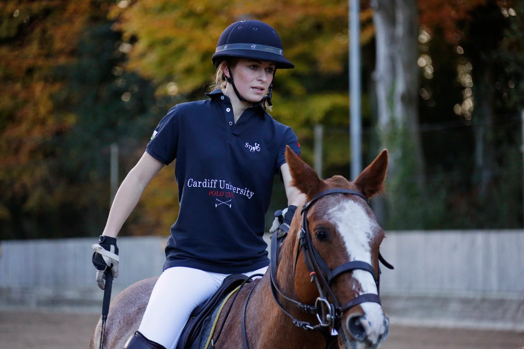
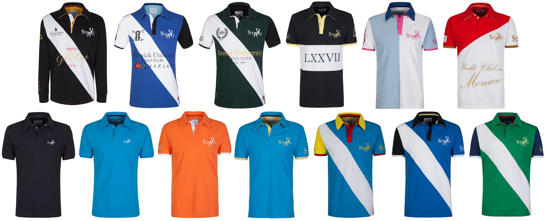
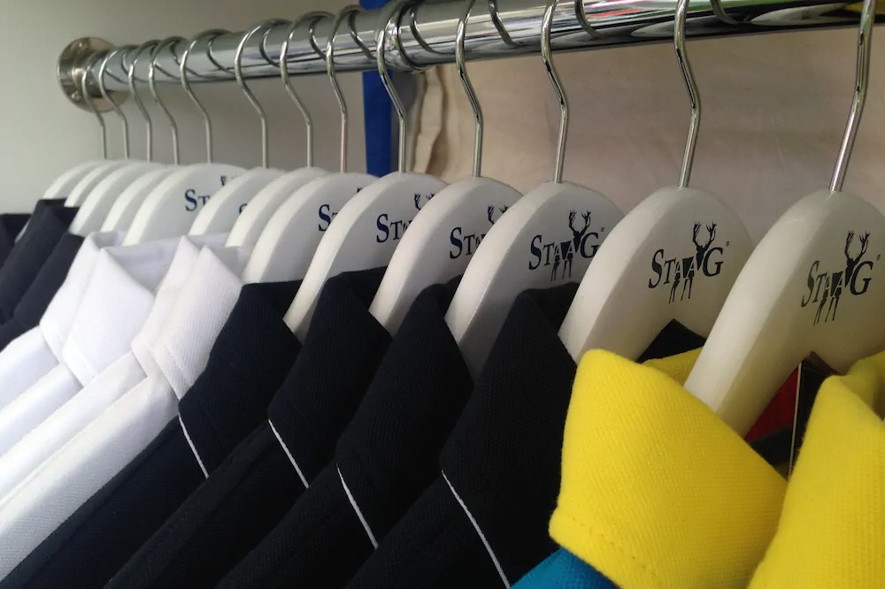
I creative directed every shot
In luxury fashion, photography isn't a separate discipline from brand. It is the brand. Every shot needed to reinforce the same positioning: premium, confident, considered.
I creative directed the product photography from styling through to framing. The art direction of every image was designed to make StaaG feel like an established player, not a startup finding its feet. When someone saw a StaaG image on social media or the website, it needed to sit comfortably alongside the brands they already knew and trusted.
In luxury fashion, photography isn't a separate discipline from brand. It is the brand.
From the box to the wash label
The packaging took the same approach as everything else. I designed the full unboxing experience, from the box itself through to the swing tags and the wash labels inside the shirts. Every touchpoint was held to the same standard.
That might sound like overkill for a startup. But in luxury, the details are the product. A customer notices when the wash label has the same typographic quality as the website. And they notice when it doesn't.
Every touchpoint, one standard
Making a brand that didn't exist yet feel established
The website had to do something specific: make a brand with no heritage, no archive, and no celebrity endorsements feel like it belonged in the luxury space. The site needed to carry that weight through design alone.
I built it to feel like a luxury ecommerce experience from the first scroll. Clean, confident, with enough restraint to let the product photography do the talking. The structure was simple because the brand was new. A focused product range, a clear story, and a buying experience that matched the quality of what was being sold.
No heritage. No archive. Design alone had to carry that weight.
Doors that a startup shouldn't have been able to open
StaaG launched and didn't look like a startup. That was the point.
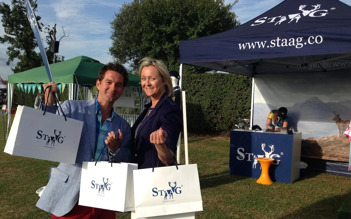
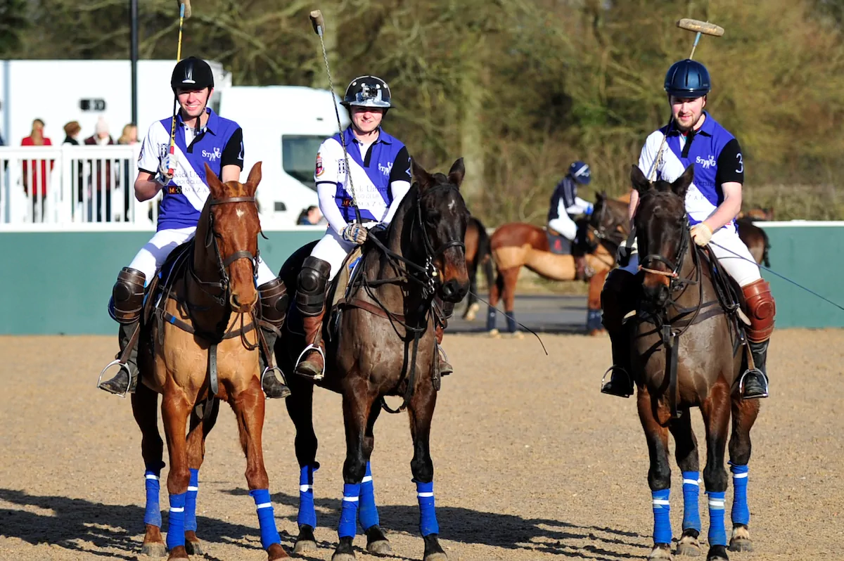
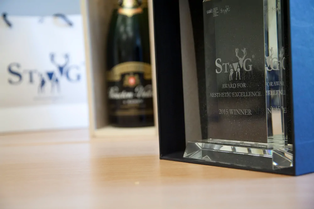
The brand opened doors that a new fashion label with no track record shouldn't have been able to open. StaaG partnered with a champagne house for limited edition collaboration shirts. They sponsored polo teams, getting the brand in front of exactly the right audience in exactly the right context. The product was in the hands of people who would have dismissed it in a heartbeat if the brand didn't feel right.
The foundation we built was strong enough that when the business expanded beyond polo shirts into leather goods, travel bags, wash bags, and wallets, the brand system could flex. It needed additional design work to meet the expectations of each new product category, but the strategic foundation held.

From polo shirts to a full luxury brand
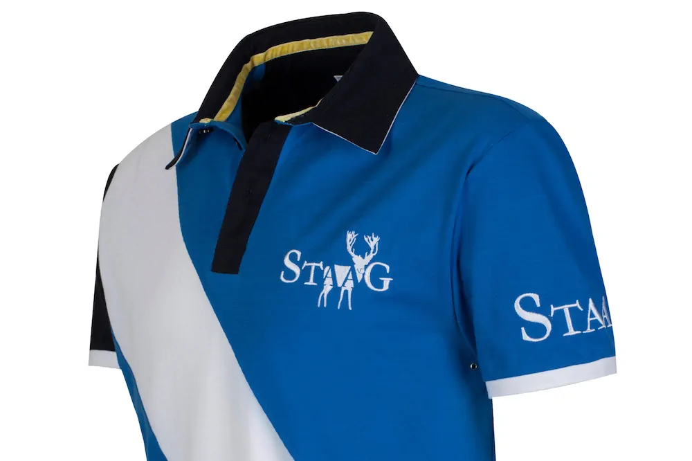
Where it started. Premium quality, embroidered mark.
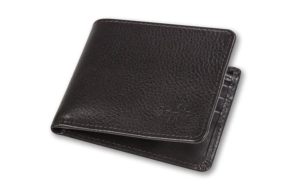
Wallets and accessories. The brand in your pocket.
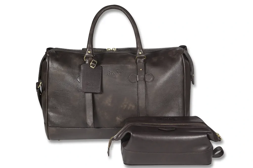
Premium luggage, and wash bags. The brand on the move.
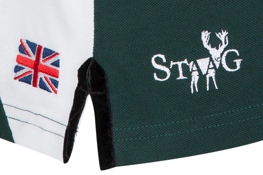
Premium quality, embroidered and velvet detail.
Here's what matters most about StaaG. In luxury fashion, the brand is the product. Think about Ralph Lauren Polo. The logo is the shirt. You're not buying cotton. You're buying what that mark represents. StaaG worked the same way.
The business was ultimately sold. And what was being sold wasn't a clothing company with some branding attached. It was the brand. The mark, the positioning, the reputation, the system that held it all together.
6 months. Built from nothing.A brand that became the product.And a product worth buying.
What clients say...
AJ
Founder, StaaG