The sub-brand that outgrew the parent
Superlens
Braeface designed Superlens's identity and chart colour system to function as both a flinder sub-brand and a standalone product. Following flinder's acquisition in 2025, Superlens operates independently without any brand rework needed.
A product caught between two futures
Superlens started life as a product inside flinder. A financial analytics platform that gave clients a clear window into their data through reporting dashboards. It worked well as part of the flinder offering. But things were about to change.
flinder was heading towards an acquisition. The details were still being negotiated, and it wasn't certain whether Superlens would be part of the deal or not. That created an unusual design challenge. Superlens needed its own identity, one that could stand completely on its own if it had to. But it also needed to feel like a credible extension of flinder for existing users and anyone who'd found it through the flinder route.
Most brand projects have a clear starting point. You're either building from scratch or you're evolving something that exists. This was neither. Superlens had to work in two possible futures at the same time.
Superlens had to work in two possible futures at the same time.
Designing for ambiguity
The strategic question here wasn't "what should this brand look like?" It was "how do you design a brand that needs to serve two outcomes simultaneously?"
If Superlens stayed under the flinder umbrella, the identity needed enough visual connection that existing clients would recognise it as part of the family. If it became independent (which it did), the brand needed to hold its own without leaning on flinder's reputation.
That's a tightrope. Too close to flinder and it looks like a feature, not a product. Too far away and you lose the trust that existing users have built with the parent brand. The strategy had to find the space between those two extremes and make it feel intentional, not like a compromise.
I'd already spent four years building and evolving the flinder brand, so I understood its DNA deeply. That knowledge made it possible to design something that felt like a distant relation rather than a clone. Connected enough to be credible. Independent enough to survive on its own.
Too close to flinder and it looks like a feature. Too far away and you lose existing trust. The brand had to sit in the space between.
When your brand colours live inside charts
The logo and identity system needed to communicate what Superlens actually does: give people a sharper, clearer view of their financial data. The name already carried that idea. The visual identity had to reinforce it.
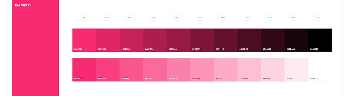
But the real creative challenge wasn't the logo. It was the colour palette.
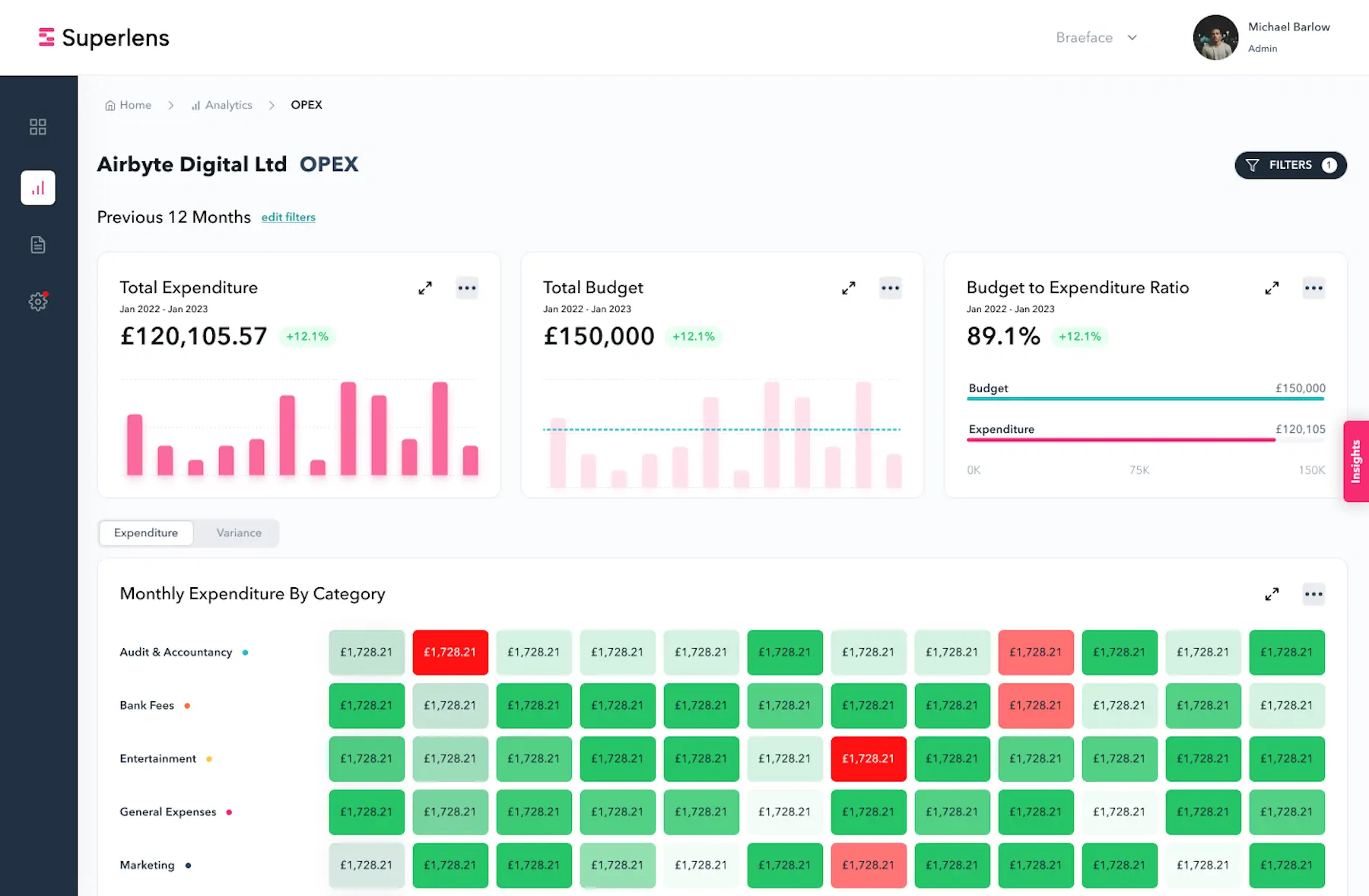
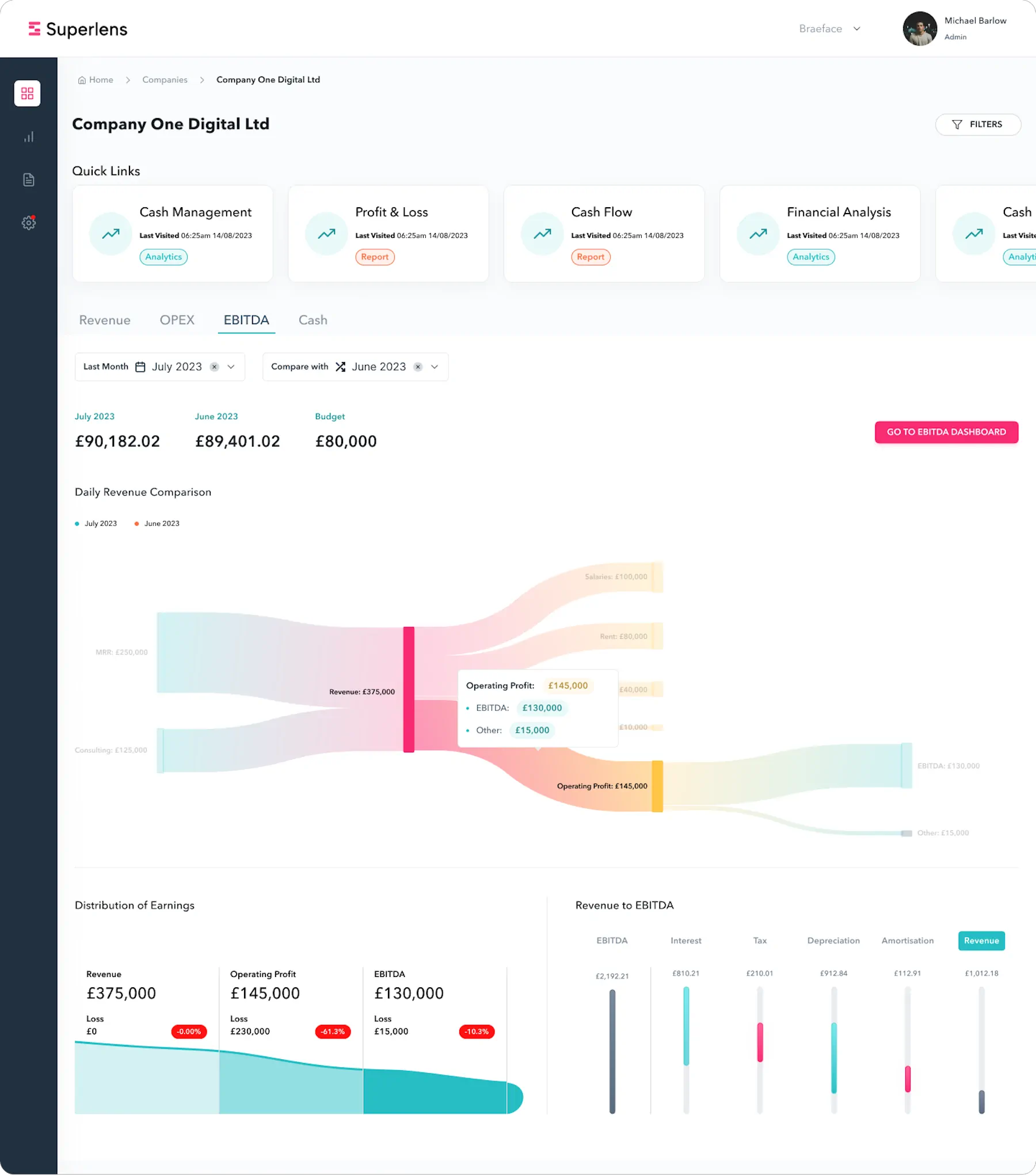
Superlens is a dashboard product. The brand colours don't live on a business card or a website header. They live inside charts, graphs, data visualisations, and reporting interfaces. That changes the design problem completely.
When you're choosing colours for charts, you're not working with aesthetics alone. Certain colours carry subconscious weight in a financial context. Red signals danger, loss, decline. Green signals growth, health, positive movement. You can't ignore those associations and throw in brand colours that fight against what the user instinctively expects to see.
I needed a palette that was distinctive enough to feel branded, broad enough to handle the range of data categories a financial dashboard requires, and considered enough that each colour worked alongside the others without clashing or creating confusion. Getting the balance right took more iteration than most people would expect. A palette that looks simple in a brand guidelines document was the result of testing colour after colour in the context of real dashboard layouts.
Built for dashboards, not just brand guidelines
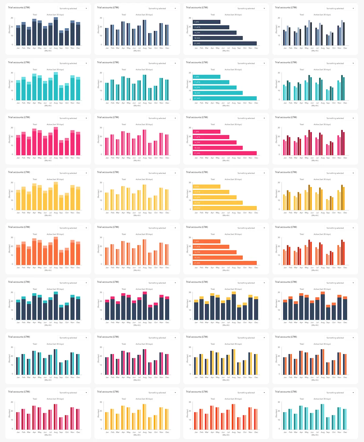
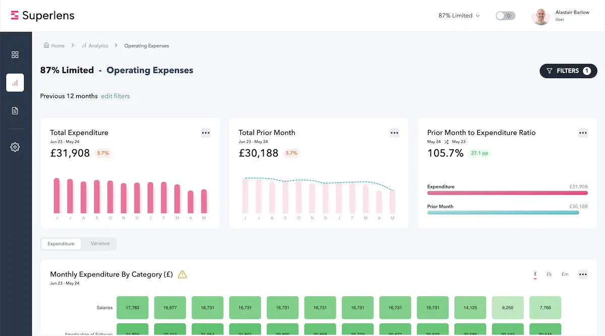
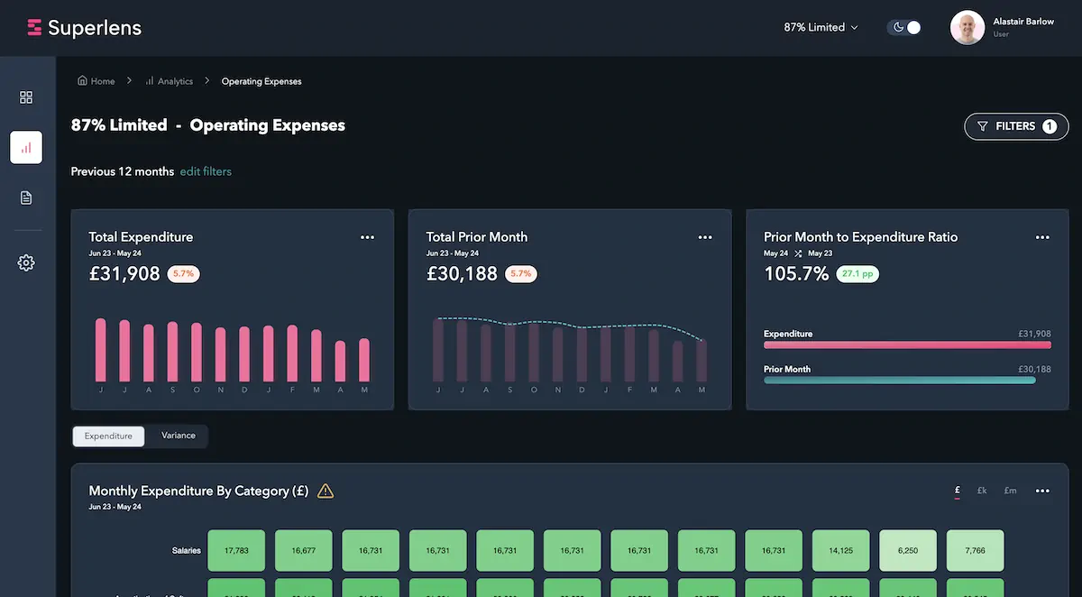
The brand colours don't live on a business card. They live inside charts. That changes the design problem completely.
Clean outside the product. Functional inside it.
The identity didn't need to be redone
Superlens wasn't included in the flinder acquisition. It became a standalone product. And the brand was ready for that.
The identity I'd built held up exactly as intended. It didn't need to be redone, repositioned, or rethought when the separation happened. That was the whole point of the strategy: design something that works regardless of which outcome plays out.
The product is now operating successfully as an independent platform. The brand gives it the credibility to stand on its own without needing to explain its origins or lean on a parent company's reputation. For users who came through flinder, there's enough visual familiarity that the transition feels natural. For new users discovering it fresh, it reads as a confident, established product.
That's what good brand strategy does. It doesn't predict the future. It builds something robust enough to handle whichever future arrives.
The identity didn't need to be redone when the separation happened. That was the whole point.
What clients say...
Chris
Product Manager, Superlens


From parent brand to standalone identity
Superlens is part of a bigger story. It started as a product inside flinder, a brand I'd spent four years building. When flinder was acquired in 2025, Superlens wasn't part of the deal. It needed its own identity. I designed that too.
That thread, from parent brand to sub-brand to standalone identity, is what happens when brand strategy compounds over time. Each project builds on the thinking that came before it.