The business that didn't have a brand
Just Sign
Braeface built Just Sign's brand strategy, identity, and website from nothing in 2016. The BSL interpreting business had no visual identity at all. The brand helped grow a solo operation into a company with in-house and freelance interpreters.
A business that existed in conversations, not visually
Donna had bought an existing BSL interpreting business. The service was real. The clients were there. But the brand? There was nothing. No logo. No identity. No visual presence at all.
The business had survived on the previous owner's personal reputation and word-of-mouth. That works when one person is running things. But Donna was stepping into a company where the credibility lived with the previous owner, not the business itself. Without a brand, there was no way to transfer that trust. No way to say "this is still the same quality, the same professionalism, under new ownership."
This wasn't a rebrand. There was nothing to rebrand. The business had been operating without any of the things most people take for granted. No mark. No colours. No consistent way of showing up.
For a service built on communication (helping deaf and hard of hearing people access BSL interpreting), the irony was hard to miss. The business helped people communicate. But it couldn't communicate who it was.
The business helped people communicate. But it couldn't communicate who it was.
Built for the legal sector. Built to grow.
The strategic work here was about defining who Just Sign was for and how they needed to show up.
At that point, the primary market was legal. Courts, police, legal proceedings. BSL interpreting in environments where accuracy, professionalism, and trust are non-negotiable. The brand needed to reflect that. It had to feel credible, serious, and dependable. This wasn't a space for playful or casual branding. The people hiring Just Sign were making decisions in high-stakes situations.
The strategy also needed to support growth. Donna wasn't running a one-person freelance operation forever. The ambition was to build something bigger. In-house interpreters. A network of freelance interpreters on call for bookings. That meant the brand had to feel like a company, not a personal brand. It needed to carry the weight of a team, not a sole trader.
The brand had to feel like a company, not a personal brand. It needed to carry the weight of a team.
Two ideas in one mark
The logo needed to do something specific: tell people exactly what Just Sign did, without them needing to read a word.
The justice scales were a natural starting point for the legal side of the business. But scales are a cliché. Every solicitor, every legal firm, every justice-adjacent company reaches for the same symbol. The challenge was to use that recognisable shorthand while making it feel fresh and contemporary rather than tired.
I simplified the scales into a clean, minimal form and integrated them with a hand (a universal symbol for signing and communication). The two elements merged into a single mark. Justice and communication. What Just Sign does, captured in one logo.
The colour palette was purple and blue. Corporate, confident, professional. Exactly right for the legal and justice environment they were operating in. These were colours that felt at home in a courtroom or a police station. They communicated reliability and seriousness without being cold.
The simplified design meant the logo worked across everything. Business cards, digital signage, documents, the website. Versatile enough for any application, distinctive enough to be remembered. For a business that previously had no visual identity at all, that consistency was transformative.
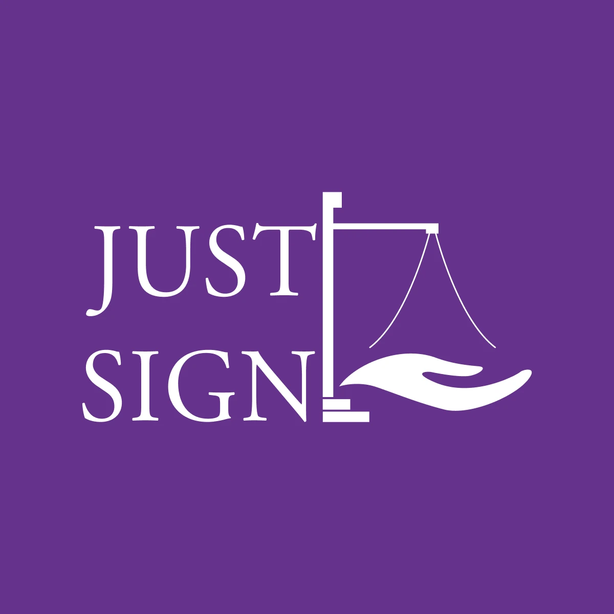
Two ideas in one mark. A hand for signing. Justice scales for the courts. The logo told people exactly what Just Sign did.
Clear, professional, conversion-focused
The website needed to do two things. Explain what BSL interpreting is and why it matters (because not everyone landing on the site would know). And make it simple for someone who needed an interpreter to get in touch and book one.
I designed and built a site that was clear, professional, and conversion-focused. No ambiguity. No unnecessary complexity. A visitor should understand what Just Sign does, trust that they're credible, and know how to take the next step. All within seconds of landing on the page.
From invisible to credible
The brand took Just Sign from invisible to credible overnight.
Before the brand existed, Donna was running a service that people could use but couldn't see. There was no way to build recognition, no way to look professional in a pitch or a proposal, no visual shorthand for "this is a serious, trustworthy company."
After the brand launched, that changed. Just Sign looked like a company. Not a side project. Not a freelancer with a business name. A proper company with a clear identity and a professional presence.
That shift helped Donna grow. She brought in in-house BSL interpreters. Built a network of freelance interpreters she could call on for bookings. The brand supported that growth because it carried the weight of a team. When a new interpreter joined, there was a brand to belong to. When a new client found them, there was an identity they could trust.
The brand took Just Sign from invisible to credible. From a solo operation to a company with a team.
The brand I built in 2016 was now working against them.
For eight years, the brand served Just Sign well. It was designed for the legal sector, and it worked in the legal sector.
But businesses change. Markets shift. In 2024, Donna made a strategic decision to pivot. The new focus: education. Schools, colleges, universities. BSL interpreting for students and staff.
A mark that communicated "courts and legal proceedings" doesn't say "we help students learn." The visual language that made Just Sign credible in one market was making them invisible in another.
So I came back. And I redesigned it.
