From bootstrapped fintech to acquired brand.
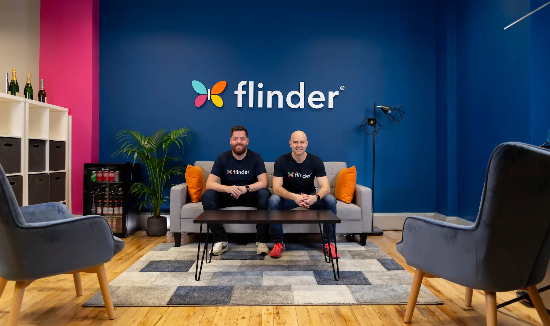
flinder
Braeface led brand strategy, identity, and web design for flinder from 2020 to 2024. The fintech brand compounded through sub-brands and ongoing collateral before being acquired in 2025, with the brand becoming a strategic consideration in the deal.
The business was sharp.
The brand hadn't kept up.
flinder was doing something nobody else was really doing. A genuinely different finance function for scaling businesses. Not bookkeeping. Not traditional accounting. Something smarter, more embedded, more strategic. The business was good. The service was sharp. But the brand hadn't kept up.
The founders, Alastair and Luke, had bootstrapped the brand themselves in the early days. And like most founders who build something real, they'd done what they needed to do at the time and moved on. But now the gap was showing.
There was no cohesion across their brand assets. The website structure was all over the place, with information architecture that had grown organically rather than intentionally. And the visual identity? It wasn't that it looked like a generic accounting firm. It was actually trying to be different. But it was different for different's sake, without any understanding of how or why.
That's a harder problem to solve than a bland brand. A bland brand knows it needs to change. A brand that's already tried to be different thinks it's already solved the problem.
Alastair told me he'd cringe when pointing clients to the website. That's a feeling every founder knows. You've built something you're proud of, but the brand makes it look smaller than it is.
Alastair told me he'd cringe when pointing clients to the website. The business had outgrown the brand.
Different for different's sake.
This was one of those projects where the founders came in with a clear idea of what they wanted to keep. Alastair was attached to the existing typeface and the colour palette. That's natural. When you've built a brand from scratch, those elements feel like part of the identity. Letting go of them feels like letting go of the business itself.
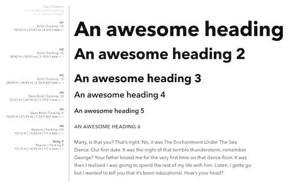
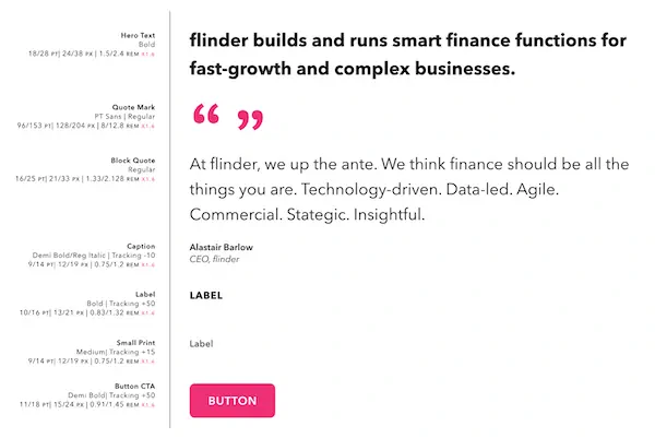
But when we worked through the strategy together, it became clear those elements were part of the problem. The typeface didn't communicate the precision and tech-forward positioning they needed. The colours were soft when the brand personality needed to be bold and outspoken. flinder was rebellious and confident. The visual identity needed to match that energy.
What surprised them was how structured the process was. They'd expected a creative field to be more about making things look pretty. Instead, they got a detailed strategic framework that connected every decision back to who they were, who they were trying to reach, and how they needed to show up in their market.
The real positioning gap was clear: flinder needed to stop being different without direction and start being different with purpose. Their ideal clients (tech founders, SaaS operators, ecommerce leaders) were making snap judgements based on how the brand showed up. And the brand was showing up as a company that was trying too hard without knowing what it was trying to say.
The brand was trying to be different. But it was different for different's sake, without any understanding of how or why.
Making the butterfly
work harder.
The butterfly had to stay. "Flinder" is Dutch for butterfly, and the mark carried real emotional weight for the founders. So the question wasn't whether to keep it, but how to make it work harder.
I rebuilt the butterfly from the ground up using the mathematical principles of the golden ratio and the Fibonacci sequence. That wasn't a stylistic choice. It was a strategic one. flinder's entire service was built on precision, data, and structure. The butterfly needed to reflect that. Every circle, every proportion, every angle is mathematically considered.
The result is a mark that looks elegant on the surface but has serious rigour underneath. That mirrors exactly what flinder does for its clients.

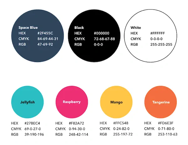
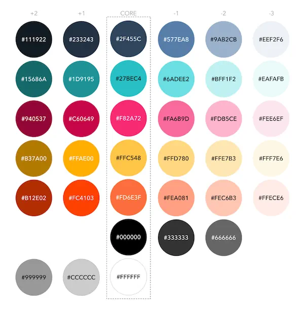
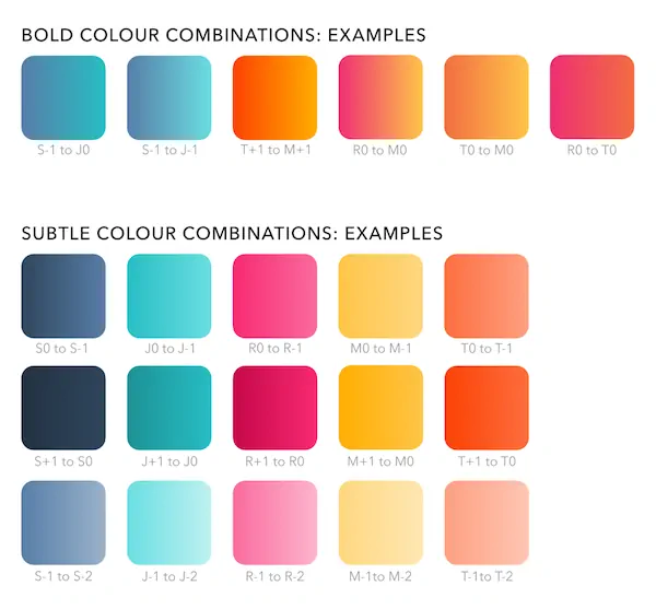
The colour palette was the other big shift. The old palette was soft and understated. flinder's personality was bold and outspoken. These were founders who ran a thought leadership conference in the French Alps and named it "flinder takes the piste." They weren't playing it safe in their business, so the brand shouldn't play it safe either.
I pushed for a vibrant, multi-colour palette that would stand out in a sea of navy blue accounting brands. Each colour had purpose. Together, they gave the brand a confidence and energy that matched the people behind it.
The butterfly wasn't decoration. It was built on the Fibonacci sequence to reflect the precision of a data-driven business.
The Brand in context


Testimonials
What our awesome past clients think of us.
Alastair
CEO, flinder

Rebuilt from the ground up.
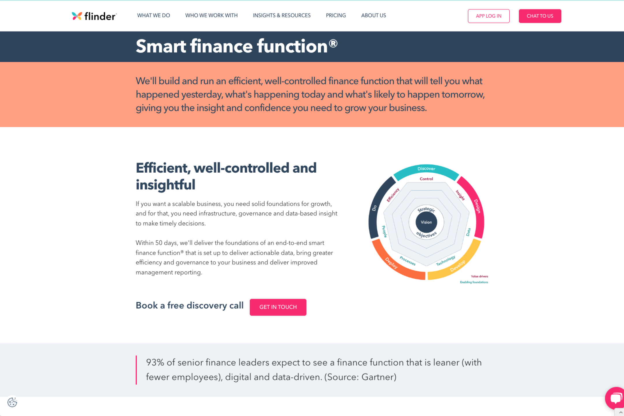
The website wasn't a cosmetic job. The information architecture was a mess. Content had been added over time without any real structure, and the site had grown in the way most founder-led websites grow: organically, reactively, and without a plan.
I rebuilt the sitemap and content structure from the ground up, then designed an experience that reflected the new brand positioning. The goal was simple: when a tech founder or SaaS operator landed on this site, they should immediately feel like flinder understood their world.
The design carried the bold colour palette and confident typography throughout, but the real work was in how the content was organised. Every page had a clear purpose. Every section moved the visitor closer to a conversation.
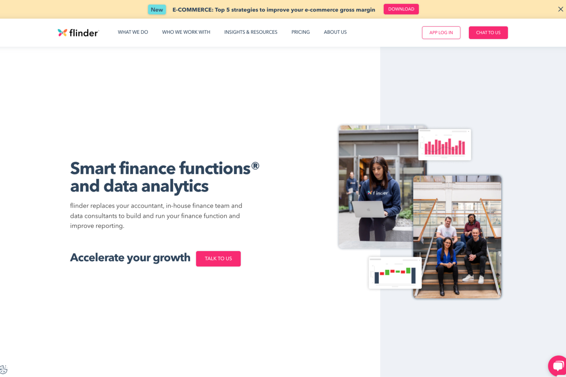
When a tech founder landed on this site, they should immediately feel like flinder understood their world.
From cringing at the website to showing it to everyone.
The rebrand landed and the response was immediate. Internally and externally.
The founders didn't treat this as a deliverable that went in a folder. They implemented it everywhere, quickly and with real pride. That matters more than most people realise. A strategy or identity is only as good as how it's implemented, and Alastair and Luke took that seriously. They wanted to show the brand to everyone.
That shift in confidence, from cringing at the website to actively directing people towards it, tells you everything about what changed.
The brand gave them clarity in their sales conversations. Instead of explaining what made them different, the brand did that work for them. It made it simpler for the clients they actually wanted to say yes.
And then there's the acquisition. In 2025, flinder was acquired. I'll keep the details light here, but what I can say is this: the brand had become so embedded in the company's identity and market position that it created real strategic considerations during the acquisition process. That's not something that happens with a logo. That happens when brand strategy has been doing its job, compounding over years, shaping how the market perceives you, and building value that goes beyond the service itself.
Acquired in 2025. The brand had become so embedded in flinder's market position that it became a strategic consideration in the deal.
The email he sent his entire team on launch day.
I'm immensely proud of our brand and our new website and Luke and I are very excited for the journey ahead.
Testimonials
What our awesome past clients think of us.
Amelia
Ops Lead
4 years. 3 sub-brands.
1 acquisition.
What started as a brand strategy and identity project in 2020 became a four-year creative partnership. As flinder grew, the brand grew with it. That's what happens when the strategy is right: the identity becomes infrastructure, not decoration.

Annual finance thought leadership conference in the French Alps. Full sub-brand, event materials, and merchandise. Now lives on independently as "finance takes the piste."
A financial analytics app built under the flinder umbrella. Wasn't part of the acquisition. Became its own standalone brand. A sub-brand that outgrew the parent.

A podcast focused on successful founders and their arc from startup to scale. Full podcast branding and visual system.
Each sub-brand had its own personality, but they all connected back to the same strategic foundation. That's the compound effect of brand strategy done properly. You don't start from scratch every time. You build on what's already working.
